Showing posts with label 90s. Show all posts

Tuesday, 28 February 2012

Developing the "Acts" concept from Sonic: Ristar and its music

It is a common concept in games to divide the content into distinct chunks. This is sensible: it allows the player to deal with only a small amount of information at a time, rather than having to consume the entire game in one continuous stretch and possibly become fatigued or feel overloaded. In games with a linear progression, where the player character is implied to be travelling from point A to B of a sprawling overworld, there is an additional tendency to subdivide. There are larger "worlds" divided into smaller "levels". This additionally allows a happy compromise of varied, cohesive, and economic design: graphic elements can be reused within a world, so that each level does not need new artwork, but as long as nothing is reused between worlds they will each feel visually distinct. Super Mario Bros. made use of the basic idea of "worlds" and "levels", but it had not yet occurred to the designers to maintain a consistent set of graphics within each world: the franchise would see that idea developed over the course of the next two games.

When Sonic the Hedgehog was developed, Sonic Team decided to be unique snowflakes by referring to "Zones" instead of worlds and "Acts" instead of levels. The first game had 3 acts per zone, but this was trimmed to two for the sequel and this has remained the standard for most games in the franchise since. Since Sonic had a much later start than Mario and other platforming series, the idea of having the worlds be visually distinct was already standardised. However, the Sonic games additionally paralleled the music with the graphics: each zone had its own musical theme, quite different from the conventions of the Mario franchise where overworld, underwater, subterranean, and castle themes would be used and reused according to the nature of the environment, rather than the theme of the world. Sonic 3 developed this idea further by having the music change slightly in the second act of each zone: sometimes only the bassline would be different, or the percussion more sparse, or the structure rearranged just a bit — and sometimes it would be almost an entirely new track with just instrumentation and some key bits of the melody in common. Compare the two acts of Launch Base Zone, for example...


...to the two acts of Hydrocity Zone.


The physical characteristics of the levels are also occasionally more distinct between acts.  The tropical Angel Island Zone is firebombed halfway through the first act, with this devastation remaining throughout the second. Near the beginning of Carnival Night Zone Act 2, Knuckles shows up to turn off the lights and flood most of the level. The Launch Base Zone, having been partially blown-up as part of a failed booby trap towards the end of act 1, is all exposed pipes and waterworks in act 2. Even when there isn't a clear visual distinction, just the change in music is often important in establishing a transition in moods: act 1 of Marble Garden has an upbeat, bouncy feel, whereas act 2 is more subdued and contemplative, thanks to a much more relaxed beat, a lead synth with a longer, more reverbing decay, a softer bass sound, and a few other subtle touches. The result is a distinctly different atmosphere.

This concept continued into Sonic & Knuckles, which was more of a continuation than a sequel, and was developed further. Sandopolis Zone begins in a scorching desert, but act 2 takes place inside a dark, ghost-infested pyramid - the music, in kind, takes a dramatically sinister turn. The most significant transition is not in the final zone, the Death Egg, but in Lava Reef. Initially the setting befits the name, with dangerous active lava-flows and fire-based traps aplenty. The music is bubbly and smouldering, but has a mellow undertone to it, lacking the aggressive feel one would usually expect from a fire-based stage. At the beginning of act 2, however, all the lava suddenly cools and solidifies, the entire colour-scheme of the level changing from heated oranges and reds to serene blues, and the shift in the music befits this: the only component that seems to carry over is a background accompaniment, rather than the lead melody, yet oddly the whole track feels familiar, as if it's changed completely on the surface but still consists of the same fundamental elements. That the change between the two acts should be so dramatic is fitting for another reason: it's from this point on that the game's plot actually starts to develop.


Ristar is a game developed towards the end of the Mega Drive's life cycle. As such, it was overlooked at the time, but has garnered a bit more attention retrospectively. Partly it's because, like Dynamite Headdy, it's a pretty good game, with a simple but satisfying central mechanic (you can grab enemies and face-smash them, also climbing up walls with your face and swinging off handles like a shooting star), rich level design, and appealing visuals. However, it's also noteable because it was actually developed by Sonic Team, purportedly based on an early, rejected concept for Sonic himself. I don't know exactly how much of its staff Ristar shared with the Sonic games, but it feels almost like a natural continuation of many ideas from the latter.


When we begin a stage, a title card pops up that is very reminiscent of Sonic 2. However, not only are the flat, graphic shapes more intricate, but we're also treated to a beautifully parallaxed pan across the planet's scenery. In-game, the environments feel like an amalgam of every Sonic game that came before, though with an extra solidity,  richness, life, and boldness of colour that can only be the result of a more experienced art team.


The Acts are here, though not by name: each of the worlds (actual planets in this case) is divided into two seperate levels. However, where the Sonic games at the time had only toyed a bit with the idea of visually distinguishing individual acts, Ristar goes the whole hog with almost completely distinct graphics for each one.


A few bits are reused, generally floor tiles and the odd bush, which, along with consistent visual motifs, prevent the acts from feeling disjointed, but the assets are almost entirely newly drawn each time. Even the boss chambers (which are too short to constitute levels) get their own graphics.


And not only are the individual elements that make up the whole drawn anew for each act, but every one has an overall artistic direction and colour pallette that marks it out from its predecessor. In most cases, we move from an open environment to a more closed one, with the colours often becoming darker or more muted to mark the transition. This makes sense from a practical standpoint, since Ristar has to initially land on the surface of any planet he travels to, but it also intils a great feeling in the player, as if we're breaking into a fortress and penetrating a lair of evil.

And the music feels like it's been developed from the seeds of Sonic 3 & Knuckles in a similar way. For one thing, the tracks are longer: Sonic 3 & Knuckles has loops ranging between 40 seconds and a minute; almost all of Ristar's tracks loops at around 1 minute 20 seconds. The compositions feel a bit more intricate as well, with a few more embellishments and more detailed use of the instruments themselves. Compare Launch Base Zone act 1 above to Crying World, the act 1 theme for Planet Automaton.


Both use a mechanical sounding style, focusing less on melody and harmony than on a rythmic beat and "samples". Launch Base's consist mostly of vocal clips, percussive hits, and sound effects, whereas Automaton's are rapid, robotic bleepings and micro-tonal descending scales. The latter also meshes well with the frequent use of pitch-bends, giving the whole piece a cohesively dissonant feel.

Also contrast Lava Reef act 1 with parts of Planet Scorch's act 1 theme, Busy Flare.


Although the two tracks describe a different atmosphere, it's worth noting the rapid, effervescent background synth starting at 8 seconds in Scorch's theme, and the slow attack and subtle vibrato on the chords at 20 seconds. These are all techniques that I don't think crop up much if at all in Sonic 3 and Knuckles's music. Glissandos are another thing that's used a fair bit in Ristar's tracks that I don't think comes up in Sonic's.

Even more important, however, are the differences in the BGMs between the acts of each planet. Just as with the graphics, there's a completely fresh piece of music for each one, but with all the crucial, recognisable parts of the melody carrying over. Often the mood that each piece invokes is quite different, but it always feels like it's been developed from one act to the next. Listen to Planet Undertow's two themes.


They're both calm, but each evokes a different brand of calmness. The first is in swing time, the second isn't, so naturally the first act has a bouncier, lighter feel. It also uses carefully constructed bubbling sound effects and shimmering, climbing I'm-not-sure-what-to-call-them-but-they're-not-scales, first heard at 18 seconds. These both suggest bubbles and light-rays breaking the surface of an open body of water. The second act's theme doesn't have so many of these details, but you can hear a little oscillating, pulsing synth starting at 20 seconds, matched by a similar, subtle vibrato on the lead synth at 36 seconds. This is more evocative of the sounds of deep-sea life, or the echoes of grand subterranean caverns. The very sparse opening also suggests a still water's surface. All of these are completely appropriate for the change in environment: the first act takes place at the surface of a series of partially submerged ruins, with a roughly equal distribution of dry land and submerged areas, populated by an abundance of fish, jellyfish, eels, and crustaceans; the second act travels deeper into these ruins, and is almost completely underwater, the only life being a few seahorses and nautilus.

I could write a whole lot for each individual act transition, but I think it best to just let you hear some of the differences yourself. What do they suggest to you?

Planet Flora:

Scorch's second act, compare to Busy Flare.

Automaton's second act, Lock Up, compare to Crying World.

It would also be remiss of me to not mention Planet Sonata, the musical world. The first act begins with some pretty, cascading arpeggios, but it quickly becomes apparent that it's a very short loop. However, in order to progress through the level, one must deliver radios to a series of grumpy-looking birds. Upon doing so, each one will sing a snatch of a melody for you, and as you collect these they will be added to the BGM. Once you've satisfied all the birds and heard the full tune, it provides the backing for the miniboss. I can't find a version that describes the development on Youtube, but here's an MP3 that does the job, courtesy of the Ristar Cluster.

CLICK

And here's the miniboss theme.

And in the second act, which takes place inside a sprawling complex of musically themed architecture, we're treated to an even bouncier, more spirited version of the same track. I promise you're going to be singing this melody all week.


The boss is something quite special. We walk onto a stage to see a little bird singing the game's boss music. Then a big, mean, ugly, and, crucially, tone-deaf bird drops in. So he knocks the little bird off his perch and, well, I'll let you listen for yourself.


Anybody who's ever enjoyed Touching Fuzzy and Getting Dizzy will appreciate the brilliance of this, I'm sure (though I should note that Ristar predates Yoshi's Island!) There's even a secret code that lets you hear the entire game's soundtrack with this distortion effect applied to it.

Why do I think all this business of reinterpreting existing musical themes, rather than reusing the exact same ones or composing completely new pieces for every area, is important? It's because it facilitates something very specific to games where you're on an adventure through environments that develop in a logical fashion, and that is the feeling of progress. Using the same pieces of music all the time makes the whole thing feel flat, as if you're not really travelling anywhere. I think this might be a weakness of many Mario games. Conversely, if every area you encounter has a completely unique BGM, they feel disconnected, as if it's not really one contiguous journey (Contra 3 springs to mind as a random example). Intelligent reinterpreting of musical themes is, I feel, the best way to make use of the "worlds" and "levels" concept I started with. The same ideas apply for the visuals of a game as well, but I personally feel that music is more important in creating atmosphere.

Of course, this isn't a completely new idea that I'm talking about. Motifs are an age-old device in music and many other artistic media. Both Ristar and Sonic actually make use of them in a more traditional sense, by having the melody from the title screen theme make its triumphant return during the ending. Ristar, however, has one up on his predecessor again with another subtle use, as the bassline from the intro video, where we first see Greedy, the big bad, reappears for the final confrontation. It's pretty much a leitmotif!

Sonic and Ristar are probably not the first or best games to make use of these ideas. I just thought it was really interesting to see them being clearly developed from one series to another. I mentioned that I hadn't found out exactly how many members of Sonic Team actually worked on both series, but one thing I do know is that two of Ristar's composers, Naofumi Hataya and Masafumi Ogata, worked on the music for Sonic CD, whose Present, Past, Bad Future and Good Future versions of every level each have their own fitting musical accompaniments. Clearly, they were already familiar with this concept by the time they worked on Ristar, so it's little wonder that what they did for it was so skilful.


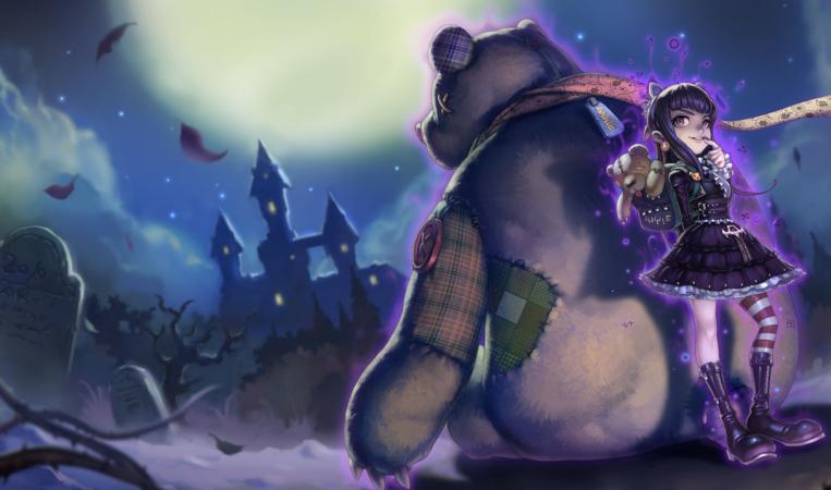
I'm currently working on a comic, but am finding it hard to get into. Comics are really, really hard! It's like a storyboard, only without the knowledge that you will be able to use acting or timing to compensate for stuff that isn't clear in the board itself. To take a break I did a few doodles trying to reimagine Annie from League of Legends, sort of like what Joe Sparrow did with Veigar and Cho'Gath. Only I'm not as good of a designer as he is.


Original.


Really she's just a generic little girl with fire powers and a bear. I made her a... more evil-looking generic little girl with fire powers and a bear? Eeeeeeh. Her lore as written for the game is that her parents are a pair of refugee mages from the conveniently-evil city-state of Noxus. Which is great because it suggests absolutely nothing about Annie's personality, so I still have almost nothing to work from. Some digging reveals that she's friends with a sad mummy, and is "surprisingly genteel" in her daily life, but that's pretty boring. I figured it'd be neat if she looked like her parents, being from a high-class background despite their refugee status, had tried to put her in a nice dress and carefully brushed her hair, only for her to burn it all because burning things is hilarious to her. I couldn't really figure out an easy way to draw burnt hair, though. And as I kept drawing more she ended up looking more and more deranged somehow. I think I subcosciously just wanted her to be really evil and malevolent. The dark circles under her eyes also evoke a little too much of a gothic-lolita flavour, but I like them because of the suggestion that her pyromania keeps her up at night. These were fun doodles but I wish I could figure out a way to be more stylistically adventurous. Mostly I was just changing between two different hairstyles and fiddling with eye shapes. I might continue to try to work up something better though. Or just toss it all out and do another champ.

The illustrations for Annie's other skins are mostly pretty foul because apparently Riot's artists can't draw girls without massive tits. The Reverse Annie picture is decent and pretty funny though.


And apparently the Chinese game client has different artwork, which is really generic anime stuff (rather than generic modern digitally painted fantasy illustration stuff) but most of it is capably done, at least.

I'm looking at the side bar and it seems like I've got a few more people subscribing to this blog than when I last checked. I'm not sure when you all started, but welcome! If you came here recently, you did so at a good time. For bonus points, find where in this post I changed tenses. Also, I offer no apologies at all for the excessive Youtube embeds. If your Macbook overheated and the keyboard melted off the chassis I'm sorry, but it's your own fault.

Friday, 3 June 2011

Sonic CD intro movie

This is my favourite animated rendition of Sonic the Hedgehog ever.

EMBEDDING DISABLED BY REQUEST :( Click for video

It basically represents everything that Sonic should always have been about, but has never quite achieved in 3D: enjoyment of space. It's essentially a minute-and-a-half of Sonic just running through nicely rendered, but plain environments, and yet somehow it's more entertaining than three different American Saturday morning cartoons and a three-season anime. The fantastically executed animation and appealing model are part of it, but I think more fundamentally it's because of the sheer joy taken in moving the character around an environment.

I've been meaning to write this post for ages, but I kept just getting lost taking screenshots of the video, because it's so overwhelmingly rich and there's so much for me to say about it. It's hard for me to think of a way to structure a post about it, so I think it best to start off slow: let's look just at the first shot in really hardcore detail.


We start off looking just at a background.

It's not quite static: the clouds move slowly to the right. The clouds themselves are tweened, but the shadows are hand animated in a nice wobbly way that implies uneven ground (I feel like I've seen the same thing done in Ghibli movies). Overall the feel is serene.

Suddenly, a cloud of dust streaks in from the right.
It reaches the middle in the space of 15 frames (at 30fps). However, it's another 23 frames before we see a small dot emerge.
This is a great way of implying perspective through timing: when moving perpendicular to our view, movement appears rapid, but parallel, it seems much slower. Distance inscreases the effect. It's a simple principle, but within the first 4 seconds, before we've even indentified the character, the animation has already been used to evoke a sense of space and distance, more than the static background itself is able.

Sonic emerges from the dustcloud...

...and in the space of another 21 frames, runs straight underneath the camera, and actually leaves the frame.
We're 5 seconds in, and we've had the character visible on-screen for exactly 21 frames: less than a second. This is an ongoing theme for this video: it's not afraid to actually omit the character. It may seem nonsensical, but it's used boldly, to give more emphasis to the environment, and in this case to further imply speed. He's running so fast he's outstripped the camera movement.

This shadow as he zips past is nice. It looks like windswept grass, of course, but also a bit like a flame.

The camera catches up to Sonic, tracking him in a really extreme top-down view.
His run-cycle is 6 frames. That's even quicker than the Compaq bird, about as fast as you can realistically get away with without doing very extreme blurs and streaks (but more on that later). The speed of the animation and the intensity of the camera angle constrast really strongly with our starting point. Sonic's size in frame in quite large, too, compared with how small (or invisible) he was a moment ago.

Sonic accelerates, and leaves the frame again.

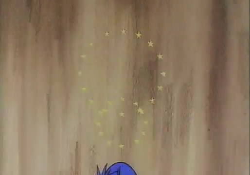
These little stars that fan out behind him are worth a mention, since they're actually a little recurring motif throughout the whole animation, generally very subtely when Sonic hits a speed boost. They're fitting though because little stars are actually a bit of a motif for all the early Sonic games. They're on the logo for the Sonic 1 title screen.
Sparkly ones appear in the title screen for Sonic 2. They've always surrounded Sonic whenever he's invincible. And they've acted as portals to Special Stages. They imply a bit of magic, and Sonic CD is quite a magical game (though that's another essay). They're quite distinct from the chunky, cartoony stars used in the Mario games.

Anyway, as Sonic runs underneath the camera, it attempts to follow him. This leads to a really wacky move as we see his trail of footprints upside down, and then the camera slowly rights itself.
The camera move itself is really cool, a really intense way to punctuate the sequence. It sort of evokes a roller-coaster, which anybody who's played a Sonic game will know is fitting. The footprints look awesome as well. Since they're close together and scrolling very quickly, they have this rapid visual rythm to them, as if we can hear Sonic's feet hitting the ground.
Sonic appears in frame again here, but very small and only briefly. What we really see is the massive dust cloud that forms in a gourgeous back-and-forth pattern as he boosts away again.
And even this gets left behind, so the last part of the shot is, again, pure landscape, though still moving rapidly.

This is all one continuous cut, and lasts about 11 seconds. We've already had very strong contrasts in timing and framing, extremely cool use of the camera, and some very nice animation. All of these have been used to emphasis a sense of space, and speed. The rest of the opening is a tour-de-force of these techniques, and tons of other little flashes of brilliance.

The shadow flashing across the mountains is incredibly cool. Technically it makes no sense, but it does so many clever things. It turns what should be a very small movement on-screen (see the size of the dust cloud) into a very big one. It lets us see the character without quite seeing him, as if he's just slightly too fast to catch sight of. It also sort of evokes the long, horizontal shadows caused by evening lighting.

The camera's static while that happens, but moves down and left, following the dust cloud as it travels the same direction, and allowing our eyes to catch up to it.
A big plume is kicked up as Sonic turns a corner, which is not just sensible but also a good way to make it clearer. The little playful little juke right afterwards is immensely pleasing. After that he slows for just a couple of frames before zooming off in a straight line.
It's just a nice, tiny little timing to help segment and organise the scene. It separates "two mountains" from...
..."two rainbows". Fuckin' splashes as rainbows, man. Who thinks up stuff like that? Awesome. Only in the 90s. There's some more little sparkly stars there, as well. The camera stays still here for about a second to provide more spacing and contrast. Something I only noticed when going through frame by frame was the very subtle way the dissipating dust cloud is animated.
From the point where Sonic leaves the frame it's aniamted on ones for 6 frames, on twos for 16 frames (8 drawings), and then on threes for 24 frames (6 drawings). Animating on threes is technically a no-no, and anime often does it simply because it's cheap. However, sometimes it has the very pleasant effect of making things feel slower and more sedate. Animating on ones causes a very frenetic, nervous feel. On twos looks normal. On threes is calming. If you want a serene scene with trees gently blowing in the wind, animating it on threes might help the effect. Here it provides another, very subtle and gradual, contrast in timing. Also, note that little bit of red that peels off the top of the second rainbow. It's delicious.

Next we get our first proper mid-shot. I guess the middle of the first scene counts, but that was all a big crazy camera move.
The shrunken thumbnails don't really show it, but there's a little flurry of leaves that subconsciously telegraphs Sonic's arrival. It's sort of like punctuation. There's a couple other devices like that which I'll point out as they crop up.
Sonic zooms into the shot extremely quickly and a bit chaotically (note the stars). I guess this is as good a time as any to point out his running animation. It's based on the animation used when he hits top speed in Sonic CD.
It's sometimes referred to as the "rubber-band" run. It's nonsensical but stylish. Using it in fanart is the official way to show you're a proper tryhard old-skool Sonic fan (or, when used in official materials, it shows that you're pandering to proper tryhard old-skool Sonic fans). He had a version of it in Brawl. Here's a page featuring it from the Archie Sonic comic, drawn by Tracey Yardley.
There's a little added twist to it here, as in some frames it's replaced by this cool-as-hell erratic zig-zaggy lightning-bolt shape.
You can see it in a couple of the earlier frames from this shot, too. In this case it has a three-frame cycle: twisted rubber-band (as in the first Sonic CD screenshot), un-twisted rubber-band (second Sonic CD screenshot), zig-zaggy. Nice. The 8-frame loop of him going round the tree messes that up a bit though.
Isn't this a great composition, by the way? The perspective makes it really yummy.
More stars!
We whip across from this static and very distinctly organised shot to...
...a very rapidly moving, chaotic shot. CONTRASTS, man! CONTRASTS!

Another very clearly organised shot.
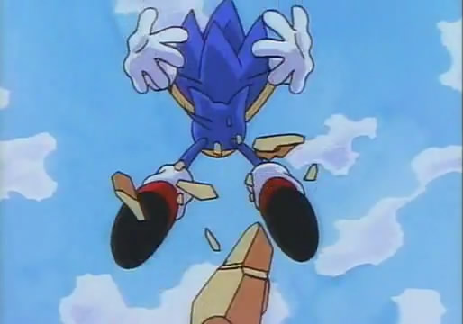
Sonic whips in very close to the camera for exactly one frame here. It's really striking. It's also the first time we've got really up close. We start to see more of him like that from here on, though.

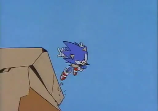
This dust that suddenly pops up after he's gone past is another one of those little punctuation marks I mentioned earlier. The rocks falling off the right cliff edge in the earlier set of screens also follow the camera down in a pleasing fashion. Just a little extra guide to help our eyes go in the right direction.

Not much to say about this bit, except that, once again, there's a contrast in timing: Sonic holds the top pose for a bit before curling up and shooting down quickly.

This next part's really delicious, though.
Sonic rolls along (I really like this way of drawing him in a ball, by the way), and whenever he bounces off a rock...
...he pops out of his ball form for just a few frames in order to kick off them.
 
It's a really lovely visual accent, and the sort of magic that I feel traditional animation is inherently suited to producing.
 
Sure, you could rig a 3D character for this sort of thing, but why spend hours doing that when you can just fucking draw it! It's spontaneous.
And doesn't he look appealing in these frames? This part reminds me of the fact that every one of these frames was produced by an actual human being, not a computer. Even if you're an apathetic, underpaid member of the Korean animation slave trade you're still a person, not a computer. Even the shoddiest of hand-drawn in-betweens has more personality than goddamn digital motion blur.
This shot is, again, in very nice perspective. Sonic moves closer to the camera, and gets really close before a sudden cut.
This bushy way of drawing Sonic's spines from behind reminds me of Sonic the Comic. This shot is a bit plain, but if you look closely there's a trail behind him that distorts the background slightly.


The closeups have been getting more frequent, and this is the first time we get really close to Sonic's face for any length of time. There's been sort of a gradual transition, starting off with seeing him barely at all, often just as a dust cloud cutting through the landscape, but over time we've moved in closer until we're literally under his nose. It's not an obvious choice to make for an intro movie (you'd expect to start with a good look at the character), but it fits with what I said before about enjoyment of space. It also gives the feel that the camera's been chasing Sonic, and has only just now been able to really catch up to him.

This next part is all one elaborate hand-animated camera move. No background plates or tweening here. Just good old-fashioned elbow grease and skill. (he also traces a nice line down through my screenshots, awesome)
And there's still room for more of those lovely big-small contrasts.
Shift to a front-on view again, with strong animated perspective and very striking use of the rocks as they pass through the camera.
And Sonic finally stops moving for a moment.

This is a good juncture to comment on how well-timed the animation is to the music. So much so that I'm inclined to believe they were produced concurrently in a back-and-forth process, rather than just storyboarding to a set track (this is a fantastic way to work, by the way, if you can do it). From the wooshing sound effect and right-to-left panning snare rush at the beginning as Sonic first enters the frame, to the way that each line of the first verse is timed to a moment in the animation ("TEN TEN" for the two mountains, "NINE NINE" for the two rainbows). This whole rapid tracking shot is accompanied by a distinct part of the track, where soft synth pads come in under the vocals. It's a clear build up to something.

 Moar contrasts, as we pull out quickly, only for Sonic to dash in suddenly towards the camera, and the music reaches a climax...
 ...something a little interesting happens. Right as we have another panning snare-rush, Sonic's animation stops, and he fades out slowly. It's a weird thing to do but it just sort of works. To me it implies he's hitting WARP SPEED.

Doesn't matter though because the next bit is sweet as hell.
Sonic's done the whole skipping/running across water thing in various different games, but it's never been as cool as this. The way his legs suddenly do the rubber-band/zig-zag thing right as he hits it is really ingenious. Combined with the timing it really gives the feeling that he's pushing himself out of the water by running against it really fast. Rather than trivialising the action by having him skim across weightlessly, the effort is emphasised, and that makes it seem so much more powerful.

And look how gourgeous the splashes are! The lack of black outlines makes the water feel really fresh and clear, and even the reflection is animated properly. And even though it's fairly complex animation, it's not like Disney's hyper-detailed realistic water. It's stylised and simplified, but still feels genuinely wet, just through simple techniques and skilled movement.

 
 Have I talked enough about contrasts in framing yet? Also, that shadow is a really neat way to give some volume to a top-down view like that.
Sonic just keeps zipping towards and away from the camera!

This shot really teases us. We don't even get a dust cloud, all we see is some rustling in the trees before a tiny dot races over the hill and suddenly he's in our face again.

The legs are on a different cycle from before, too. Now it's four-frames: two-looped rubber-band, zig-sag, two-looped rubber-band, three-looped rubber-band (third to last screenshot shows what I mean). They really go all over the place but it looks neeeat.

The song continues to build towards the chorus, and we get more and more of the character moving into and out of the shot.
THE
POWER
IS
IN
YOUR
MIND
TO
SHAVE
THE
PLANET
TO
CONQUER
TIIIIII-
-EEEEEEE-
-IIIIIIIIIME.


Did you spot the flash frames of Sonic drilling through the rock first time through? My mate Andy didn't. But even if you don't, they're suitably emphatic for the climax of the song (and the cheesy lyrics even fit!)


The view is once again pulled out here but the movement of the tiny Sonic zipping around this mountain is really slick and satisfying. The bit where he leaps off the little outcrop on the right onto the main body is especially bejujular.

Can you tell I'm running out of synonyms for "good"?


This right here is just some super awesome animation. Really pushing the stylised legs. It's almost a shame it's so brief, stills barely do it justice. I like how after looping so quickly around the rock Sonic does just one extra spin in mid-air. Whenever animating something rotating, it's always a good idea to add just one more spin.

These red sparks are an excellent detail to emphasise how much the chain is straining against the weight of an entire planet (and itself, probably).


Most extreme camera move yet? I like the streaky background as the camera pans around, too.


As Sonic goes into a spin here he flashes out of the compact ball for the odd frame or two and we see his face. Nice little detail!

More stars! It's not always apparent, but they seem to always between circular and triangular arrangements on alternate frames. I don't know why, but it's always fun to discover whatever little systems the animator came up with for what he was doing.


As Sonic rolls down the hill, he does a little hop partway. This adds a point of interest to the action and stops it being all one smooth motion. It also reminds me of a peculiarity in the Game Gear version of Sonic 1 where if you rolled down a hill fast enough, Sonic would do a hop right at the bottom.

The last shot is the icing on the cake. There's three seperate backgrounds, but on continuous sequence of animation.

There's a little splash on the surface of the water...
...and then a barely visible dot shoots up...


Spot the pixel.
It quickly turns into Sonic.


And as his face fills the screen, there's a hidden cut (well, it's actually a cross-fade of about 6 frames, which is a pity because I don't think they needed it!)


Then, as he enters the cloud cover...


...and emerges from it, we get a full sense of scale.


And finally disappears for the last time.


All throughout, while there's constantly rich and interesting animation, there's a strong emphasis on bringing the character into and out of the frame (both in terms of depth and literally being inside or outside our view). The idea is that all the space that exists is free for him to exist in. Unlike the side-scrolling 2D games, he's not limited to a flat plane at a constant distance from the camera: he can literally go anywhere and travel in any direction, whether it's ten miles from us, right up close, in the center of our view, or off the screen.

This is also used structurally, to an extent.

A graph of Sonic's distance from the camera.
For the first 15 seconds he remains at a distance, and any closeups before around 25 seconds are either very brief, or from an obscured viewpoint. As the song builds in tension there are lots of relatively small changes in depth, but after it really kicks in the changes are less frequent, but much more extreme. Note that it's only after the first third that we have any lines going all the way from top-to-bottom or vice-versa. And any part where there isn't an extreme change in framing instead has a distinct action that needs to be seen clearly (skipping across the water, drilling through the rock). There's probably more information to be gleaned from this graph, inaccurate as it is.

This is, to me, what Sonic as a character should be about. All attempts to have him engage with other characters have been, to me, mediocre at best. No extraneous friends, no talking, no drama, just action and space and FUN. My god, doesn't it look like Sonic's having a good time flipping around rocks and rolling over hills and running on water and shit? Why can't any of the 3D games be that satisfying? CAN they be that satisfying? Of course, you couldn't ever make a cartoon or comic series out of Sonic running around, but maybe that's a sign that the whole idea is flawed. Sonic's a videogame character. If it weren't for the constant troubles his games have been having for the past decade, maybe more people would accept that and we'd have less fanart of Sonic pregnant with Shadow's child (I did actually find this on Deviantart but I can't bear to actually post it).

This masterpiece, according to the credits, was directed by Yukio Kaizawa, and the lead animator was Hisashi Eguchi.


Here's a little animation I did sort of inspired by this.


I drew from a few different sources: the way he distorts when he revs up is from Sonic Advance; the little white streak that spins around is from Sonic Spinball; the dust cloud is partially ripped from Sonic 2. I don't feel I quite got the model down right (I was sort of aiming for an in-between of many things), but I still think it looks nice.