I really love how alot of Brood War maps look.
By the necessities of game balance, they are almost all symmetrical, though this symmetry can be either rotational or reflectional. Reflectionally symmetrical maps are beautifully kaleidoscopic and inkblot-esque, while rotationally symmetrical maps tend to look like a spinning wheel or tornado.
The above are all three- or four-player maps. In professional play, where all games these days are 1v1, this means that players can spawn randomly in any of the available locations, so scouting is necessary to determine where your opponent is. The spawning locations also affect the flow of the game, as closer rush distances permit different strategies to longer ones. Strictly 2-player maps exist as well. They tend to be a bit less pretty, but I still like them.
I also like the ones that use precise geometric shapes or detailed repeating patterns. Hexagons are popular because of the isometric perspective.
I think there are two reasons that these maps look so nice. Part of it is simply the evolution of design over about a decade, as the game itself hasn't been patched for balance since 2001. This means that the design of the maps could progress in a very stable, controlled way. With a good understanding of what works and what doesn't, mapmakers can work around their restrictions more easily. I must confess, though, that where maps have been revised for balance, I often find myself liking the older versions a bit better (older versions on the left).
I didn't sort these maps by the date they were made as I saved them, but we can also look at some maps made by Blizzard, which were done when the balance of the game was less well understood (also because Blizzard have always been a bit incompetent in that regard).
Bearing in mind that these are very much cherry-picked as the nicest-looking. There are tons more disordered abominations that I didn't bother saving and I can't be bothered to trawl through the
Liquipedia map database to pick them up. Even these just look less sophisticated and intricate than the maps above, which were all made for leagues under the jurisdiction of the Korean e-Sports Association, such as the Ongamenet Starleague, the MBCGame Starleague, and Proleague. However, they still look nice because of the second overall reason I like these maps: the graphics themselves. The isometric perspective and the fact that they're rendered with pixels rather than polygons just means they're crisper and cleaner. I don't wish to go on a big rant about 2D vs 3D, especially because I know that nostalgia plays a part in my preferences here, but I feel like the fact that a pixel is able to be exactly the colour you tell it to be and go exactly where you tell it to go results in a much purer image than one consisting of polygons, which are affected in unpredictable ways by camera angle and lighting.
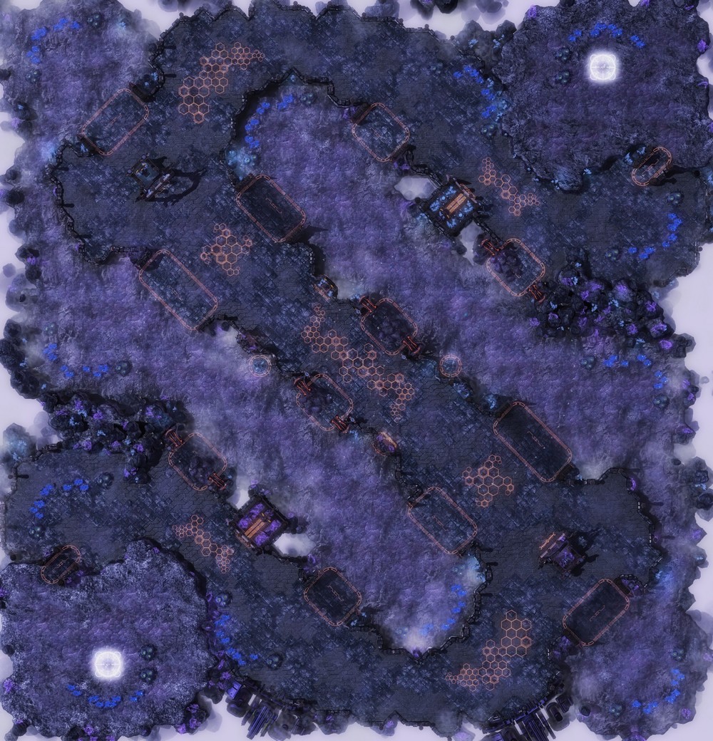
Here are some Starcraft II maps for comparison.
Apart from the fact that the layouts themselves aren't as interesting due to less development, there just isn't the same kind of precision and clarity. They can add nice details that look good close-up, but I like how the BW maps are clear, pleasing designs even as thumbnails. Also, they haven't yet figured out how to make rotationally symmetrical maps balanced. I doubt SCII maps will ever become quite as refined as BW maps since the game itself is going to be continually patched until at least a couple of years after the second expansion, but we can only wait and see!
Here are some more bonuses. 2v2 games were, in the past, incorporated into certain professional leagues, and there were some good maps for them too.
Although the most development and competition occured in the Korean scene, there has always still been a strong western community with its own ladders and leagues, and though they also use most of the maps used by the Korean leagues, there are also mapmakers who contribute their own, and they look pretty good too. They seem to be a bit more organic than many Korean maps, but there are great touches like the minerals around the centre of Sapphire.
The World Cyber Games is a Korean organisation that organises an international league for many games, including, until recently, Starcraft: Brood War. They seem to operate somewhat independantly from the other Korean leagues as they apparently commission their own maps. I'm not familiar enough to know if they're considered balanced, but they look neat too!
And here's just a few more KeSPA maps I couldn't fit in elsewhere.
That's it!


Crusader.jpg)


