Monday 21 December 2009

Rock and Rule - Mock, the coolest animated character ever.


A while ago, back when I first discovered John Kricfalusi's blog and was reading through a whole bunch of his old posts, I happened across this one, about a 1980s Canadian animated feature called Rock and Rule, which was mostly pretty dodgy but had one character, Mok, who really stood out. I was pretty impressed by what few images and Youtube clips there were (at the time: it seems there are more now), but I wanted to see more so I rented the DVD, and eventually ended up buying it.

Here's a few of my favourite Mok bits, edited together in a dodgy fashion (though I've not included everything by any means).


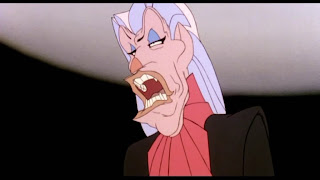
His introduction is the BEST. It's like the intensity and the tension and the solidity are all at 110% the entire time. I don't feel his animation is quite as consistently amazing throughout the rest of the film but it's still incredibly impressive. If I could ever animate something so complicated so well I'd die a happy man.


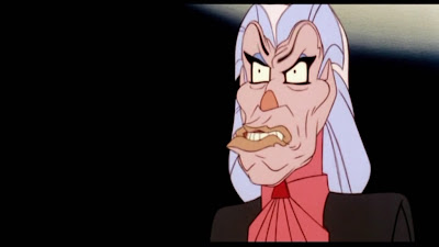
His lip-sync blows my goddamn mind. His muzzle has this amazing sinewy, muscular taughtness to it, really like some super-chiselled, rugged, middle-aged rock god straight out of the 80s. His lips look like they've been carved out of stone. Only they roll around and chew up syllables in this fabulously decadent, organic fashion


 I feel really, really dirty for enjoying the way he introduces himself.


"I'm Mmmmmmmmmmmmmmmmmmmmmmmmok!"
Over-animation, maybe, but with Mok it's justified since he's meant to be a really decadent, self-indulgent personality anyway.

His features are constantly packed with this tense energy that gets built up and released in a really satisfying way.


But it's always animating around a consistent default position, which is part of what gives it such a taught feel. As if it's been forced and moulded into that shape by years of arrogantly pursed lips and puffed up haughtiness. That maw really feels like a cavernous space filled with rows of immaculate teeth. Even when it's closed! And not just that, but you even get a sense of the thickness of the flesh surrounding that space. Mok's mouth is a phenomenal achievement of drawing... and it's not even still drawings! It works no matter what position it's drawn in.


There's some great acting in parts, too. This bit where he reacts to Omar's little quip just kills me every time. That first held expression is great just by itself,

 but then he starts screwing his face up and unscrewing it, with subtle little touches like the tongue coming out for about two frames,
 

 and then those incredible lips flare out, exposing the teeth as he bursts into full laughter,

and all the while his whole head's slowly turning side-to-side, without a hint of unintended deformation. No cheating here, just really, really good drawing.

Of course, this is also dependant on Don Francks's brilliant voice-acting. It's all very well doing amazing animation but it won't work if it's unrelated to the dialogue, and all the above was clearly done by listening to the voice-track over-and-over, and emphasising all the subtle inflections the voice-actor put into it.

The animators pushed for some good acting with the other characters, too, but it's kind of hard to get over how generic (in the case of Stretch and the fat, glasses-wearing guy and many others) or awkward (in the case of Omar) the designs ended up looking (probably as a result of too many executive decisions). The fact that Omar spends much of the film being really unlikeable doesn't help his case much either.
I kind of enjoy the bits where he's being all intense and manly, though.


Just in case you're wondering why Angel has such big eyes, it's because this woman was in charge of animating her.


 I think it's kind of cool that she ended up drawing the character looking like herself, though. Deborah Harry, who provided Angel's singing voice, says in the making-of that the song-writers were told to imagine that they were making the music for themselves, not for "a little character". I guess this also carried over to the animators. Angel suffers less than some of the other characters from the whole dog-nose thing so Bardwell was doing something right.

This is the insane genius who animated Mok, by the way.

I said that if I could successfully animate a character like Mok I'd die happy, but if I could do it while looking this chilled I think I might just attain Nirvana. That's probably where he is now. If not I'd love to see what he's worked on since.

Apparently Mok's design was inspired a bit by the Devil character in Nelvana's earlier short, The Devil and Daniel Mouse, which is helpfully included in the DVD extras.


He's not as solid as Mok (I don't know if Budd animated him, though he definitely worked on the short) but he's still pretty entertaining, and the resemblance is clear. The carved-out lips are a dead giveaway.

It's kind of annoying that the PAL transfer to DVD was so bad. I've hidden it with my screenshot selection, but it's hard-telecined from 24fps to 25, rather than just sped up with a 1:1 frame equivalency (a much preferable method), so almost every other frame is blended together, and it's especially bad in parts with motion on ones. Add to this tons of artefacting, and the fact that it's from a VHS copy as the original prints were lost in a fire, and I start to get really annoyed that such incredible animation has to be so damaged. For all the film has a laughable plot and some highly questionable design decisions, watching the making-of featurette it's kind of impossible not to have respect for how much the artists who worked on it really wanted to make something great. Everybody who worked on it was really into it. I've spent all this time talking about one character, but even the special effects people pushed pretty hard to innovate, using real cow-brains for the texture of the demon at the end of the film, employing lasers for the flashy lights in the club scene, and really going all out with some incredibly ambitious multi-plane camera effects. Which had to be programmed by hand. None of this After Effects compositing bullshit, actual PEOPLE made this film. It's very easy to take for granted how easy it is to do some things these days, especially when you're a young thing like me who's had these things available his entire life.

Looking through the clips on Youtube, it looks like the NTSC (30fps) transfer was much better, at least in terms of frame-blending. Maybe I should've bought that instead.

I've got a few ideas for the next post, but that probably won't come within the next couple of weeks due to Christmas and lounging around at home (and doing volunteer work, oddly...). So, Christmas Wishes to both my readers. Hope you're enjoying the snow.

Saturday 12 December 2009

The rumours of my death have etc. etc.

It has come to my attention that all my friends think this blog is a big angry ranting platform and I am a big angry ranter who doesn't like anything. This isn't true at all! I think it might be because my reviews of Waltz with Bashir and Up somehow became infamous amongst my colleagues. Also everyone I know who has a blog uses theirs just to post their own work, so maybe people think I'm a weirdo for writing in mine instead, but that's another issue.

Anyway, I like plenty of things! It's just that they're things nobody else gives a shit about.

So I'm going to make another post about Hidamari Sketch. Sorry.

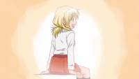
Since that last entry the second special aired, and we got subs for both of them, and then they were released on DVD so we didn't have to put up with TBS's hilarious HD upscaled broadcast quality. The second episode didn't have such obviously distinct art direction or colours as the first, but I think it was quite a bit better. It also became obvious fairly quickly why the animation quality was a bit dodgy in the first special, since more money was clearly spent on this one (though I think it wasn't always spent well: more on that as I continue writing).

We start with a fanciful little dream sequence, which begins with this crazy pan down a big grey halftone pattern. Crazy because, due to an unfortunate coincidence of the speed of the pan, the resolution of the pattern, and the frame-rate of the video, it strobes horribly. Which is a real shame because I think it's a nice idea.
Right from here the animation is quite a bit fuller than we're used to. It's pretty small and there's not much to it, but it's still nice looking. The first of many signs of where the animation budget for these two episodes went!
I like how the water as Yuno scoops it out is this very subtle, icey blue, and the raindrops have a very slight indigo tint. It works really well with the otherwise pure greys and contrasts nicely with the orange umbrella.

It's nice how one segment of the umbrella's lighter, too. It may or may not have any intended significance (it's hard to tell with SHAFT sometimes), but it stops it looking too plain. Also, given that I've now posted a picture of a naked underage fictional girl I think I am technically a paedophile and guilty of a victimless sex crime according to current British law. So are you for looking at it.

Things go almost black, but then the warm flesh-tone comes in, then the blues become warmer too. The animation on Yuno's hair in that fourth shot is very watery and pleasing. Then we're back to normal colours, but even then they're atmospheric: this looks exactly like the inside of my room on a brisk morning.
By the way, this cinemascope thing was only for the intros of these two special episodes. It felt a bit cramped and weird the way it was used the first one, but I think it works much better here.

I quite like bits of the sequence that follows, too.
Rushing for school, Miyako slips on the wet stairs and Yuno catches her by her strap, which tears, thus setting up the plot for the first half of the episode (gripping stuff, folks). This shot is simple but the timing is really nice, a great combination of "surprise" and "oh shit saw that one coming"


I'm not always sure what I think of bright blue skys like this but I like it here: it's a reasonably clear day but still feels kind of chilly. I also like the big pure white space in front of Miyako in the second image. Incidentally, that shot's in-betweened on ones, which I think is a bit wasteful as they could've spent the time and money just doing it on twos and made the drawings better (but, then again, being on ones does give it a rushed, hasty, tense feel, which is appropriate for the situation). There's a few instances of this throughout the episode.


Really nice use of spot-colour for emphasis here.

Later, in school:
More emoting backgrounds.


Remember those shots of Hiro's buns in the last episode? Here's some more "establishing shot of a character with a close-up on their hairstyle" (because that's the only way you can tell character designs like these apart, hohoho). I'm geeking out a little more than usual by knowing this but this girl is a recurring extra called Mami (one of at least two who appear much more often in the manga than they do in the anime).

Yuno's floaty hair here is another example of "inbetweening on ones rather than just doing better individual drawings".
This little graphic sequence is very cute. The arrow stops as it hits the bottom edge, accompanied by a little squeak from Yuno and the text changing (presumably to "Ow!" or some reasonable equivalent).
Some weird-looking flat-faced boys here. But I do like their inclusion because it removes us a little bit from the usual girls-only world of the moe SoL genre. And I like how that sparkly pink graphic is apparently what Shinbo thinks an abstract representation of "teenage boys trying to see a girl's bra through her shirt" should look like (or maybe it's not Shinbo himself, I'd love to know what the actual creative process for this show is).
Also, note the way the extras are represented in the second image. Other episodes have rendered them differently.

(this from the first episode of season 2, by the way, which I will have to do a post on because it's great)

It's great how they mix things up like this, just for its own sake. A few more scattered examples from this episode.
I like how Yuno's been blanked out in the third one but still has her X's. That shot is also one of many elaborate, wobbly, fully animated camera moves in this episode, more evidence of where the budget went.

Again, later, after class, Yuno and Miyako head to the mystical "arts prep room" at the summons of Miss Yoshinoya, to get Miyako's strap fixed. On the way they ponder what goes on inside.
Normally I'd complain about this sort of clutter, but I think it's used cleverly here. The big circle draws your eye very strongly, and you kind of filter out the messy surroundings automatically because of it, and thus it's like the real process of letting your mind wander and reducing the outside world to background noise: it's getting the audience to do the same thing as the characters.

There's also a couple of other unrelated interludes here, one of which is this.


In this sequence Natsume, the token schoolgirl lesbian (well, the only confirmed lesbian) gets lent an umbrella by the unwitting object of her affection, Sae. As normal she puts on a typical tsundere act (look it up), though it doesn't get very far this time.

Why am I picking on this sequence? Well, I love the coloured ripples at the start. I love that long, slow, clever pan down the building (I just about shat a brick the first time I saw it). I like the shot where Hiro opens her umbrella, shown in a graphic, almost abstract way. I like the suddenly hot, bright colours about 43 seconds in. I love the way the sound of the rain fades out behind that sparkly sound effect towards the end. And overall I think it's just a nice, sweet, understated scene.

I just kind of wish that really weird-looking move from about 00:49 to 00:51 wasn't there. It's kind of clear that, rather than putting the time and effort into thinking about the acting or good drawing, it was just put into thoughtlessly in-betweening on ones, and it's a real shame. There's no consideration of timing, the in-betweens are completely even, so there's no emphasis or focus on anything, and the actual point of the shot (that she's smiling) is completely lost. The drawings don't even animate properly, as you can see from the strange morphing hair and the sliding nose. Even if they did, as I said before, animation on ones looks tenser and faster than if it's on twos or threes (especially if you can't afford cleanup good enough to avoid boiling lines), which clashes badly with the mood of this scene.

The shot before and after achieve alot more with alot less, I feel.

Anyway, there's my one mini rant. Back to the plot, Yuno and Miyako get to where they're going, and the strap gets fixed.
Nothing visually stunning here, but I am rather more amused than I should be by this: Miyako slips her uniform back on over her head whereas, when she put it back on earlier after Yuno's patch-job, she was painstakingly animated doing it up properly.
I chuckle, but this is, I think, not an entirely arbitrary decision, since each way fits the pacing of the specific scene. Of course, in order for the second time to be shorter they could've just showed us the last step of Miyako doing up the buttons after putting it on normally, but that would be no fun, and this is Miyako.

Also these desks are so wide I had to widen my blog to fit them.

The second half of the episode adapts a story that actually came from the Hidamari Sketchbook artbook, where Yuno loses her own sketchbook. Things shift more from stylised visuals to plain slice-of-life, so there's not so much to post from here, but there's still a couple of nice touches.

I love this pallette.


Thinking back to the slipping sequence, it's styled slightly differently.
This eyecatch is kind of funny because, despite looking all airy and light, it's accompanied by a hilarious "BONK" sound effect thanks to the context of the preceding scene (which I shan't tell you).

More nudity, sorry. If this offends you, don't look at it!

This is pretty much just cute. And actually, it's straight out of the manga. Well chosen in that regard, though.
End.

Overall, despite a few slip-ups and dodgy decisions, I still feel the episode as a whole worked well, and there's constant little experiments going on. Actually, I'm inclined to think some of those things I called poor decisions might have been experiments in themselves, SHAFT seeing what results they get if they concentrate on different aspects. They did something similar way back with the second episode of the first season, where the editing style was very choppy. It was a bit jarring, but clearly it was just an experiment because it was pared back and much more pleasing in subsequent episodes.

So there you go, I only complained a bit! I promise the next entry will not only not centre around complaining, but it also won't be about anime, so people might actually want to read it.