Showing posts with label colour. Show all posts

Sunday, 8 February 2015

Sonic 2 8-bit ending

My most recent post drew a bit of traffic to this blog, and a couple of people responded really positively to my old writings about the intro movie for Sonic CD. My friend and contemporary Chris Cox posted a sweet little redesign which he said was partially inspired by it.


On its own it actually sort of reminds me of Sonic Pocket Adventure, a little-known but surprisingly competent game for the Neo Geo Pocket Color.


However, he also made a dusk version of the same image, with a different colour palette...


...which reminded me of something else entirely: the ending sequences for the 8-bit version of Sonic 2.


Although the 8-bit Sonics are definitely less developed than their mainstream 16-bit counterparts, I had a Game Gear long before I had a Mega Drive, so these games hold a very special place in my heart. The ending sequence to this game is very simple: it's just Sonic running from left to right across a scrolling background (joined by Tails if you got all the Chaos Emeralds for the good ending), with credits displaying at the bottom of the screen. However, they do something really nice, by changing the colour palette through 9 different iterations to convey a transition from midday, through afternoon, to dusk, and finally to night.


Aren't these colour palettes wonderful! I love Chris's redesign and colours, but his dusk version still feels a little bit like there's just a magenta filter over the image. Each of these, though, feels almost like an independant, new colour idea in its own right! There are such bold, shameless changes in saturation, hue, and tone. The almost pure grey sky in the second image. The bright, cold blue trees against the rich, almost cherry red sky in the sixth. The way the default neutral grey of the checkerboard pattern completely takes on the ambient colour.

Even the whole balance of contrast is played with to suggest the changing light conditions. Take a look at just the 5 colours used in the trees and grass.

At the start a strong, overhead, midday light is suggested with a high contrast between the lightest and darkest tones, and a gradual gradient formed by the 3 colours in the middle. However, as the sun goes down, this balance changes. The first colour actually becomes darker than the second, to suggest a strongly tinted light catching on the edges of leaves. In the 5th and 6th palettes, the second and third colours are almost, if not completely, identical, and quite bright, while the shadow tones remain very dark, to suggest the sharp, long shadows and the light getting right in your eyes that happen at sunset. And as night falls, the contrast within the trees becomes muted, so that,where before they were mostly darker than the sky, they are now entirely lighter. And all this is done without actually changing any of the pixels in the artwork, just shuffling the palette.

It's really brilliant. I want all lighting changes in cartoons to be done this way!

The music on the Sonic 2 endings is really lovely, too. I kind of prefer the bad ending theme. The soft attack and slow decay of the lead instrument give it a wistful quality, and the melodies, while still upbeat, are a little melancholy too, so it really does the job of marking the fact that you've beaten the game but something sad still happened (that is, Tails died because you're a failure).

They also both have this bouncy triplet rythm to them which really matches the pacing of Sonic's running animation!

I think 8-bit Sonic 2 actually has a really good soundtrack in general. These games are from a time when credits lists for games weren't really exhaustice and often used pseudonyms, so the composers for this game are listed as "Tomozou", "Simachan", and "Ray". The only one I can get any more details on is the first, Tomozou Endo. I may have mentioned this before, but a long time ago I was kind of into making covers of stuff in a PC version of the music maker from Mario Paint called Mario Paint Composer. I started a project to cover everything from the game but lost interest before I finished. I think some of what I did still kind of holds up though!


Linking to my old Youtube account is kind of embarassing but hopefully the stuff that's on there isn't too weird.

This is kind of a tangent, but all that colour stuff made me think of  the cartoon My Life as a Teenage Robot. It did some really really nice stuff with colour in general, and would just entirely replace the main character's normal white and aqua colour scheme to suit the mood and lighting.


It's actually a pretty good cartoon overall, from what I can remember. I had a quick thumb through some episodes to grab those screenshots and it made me want to rewatch it. I think it went a bit under the radar at the time but it had a respectable run of three 20+ episode seasons and a couple of specials.

I've got alot on my plate in terms of cartoon watching right now, though. I only just got round to properly starting to watch Adventure Time a little while ago and oh my god I love it so much. All the characters are so perfect and the writing is consistently great. I think about writing about it sometimes but chances are the fandom's already said everything there is to say there. Anyway after that I need to get up to speed on Steven Universe as people seem to be responding really positively to that, too. So it's kinda hard to justify the time I'd spend rewatching something right now.

Wednesday, 3 July 2013

A Theory of Game Design

This is a framework for thinking about game design that I've been mulling over for a little while now. I was considering including it in my last post about the Touhou games, but I quickly realised that it was getting big enough to merit its own entry. It consists of three categories into which I think all the primary aspects of a game fit: mechanics, level design, and avatar design.

Mechanics covers how a player controls the game and what their objectives are. In a platform game, it concerns things like the acceleration of the player character and how gravity affects them, or how a stage is beaten (usually "reach the end"). In a multiplayer real-time strategy game, it can cover things like unit selection and control, resource management, how technology trees work, and victory conditions (destroy all of an opponent's buildings, eliminate their army, kill their commander etc.) The mechanics essentially dictate a game's genre, and their level of refinement defines how pleasing it is to play on a basic, ergonomic level (compare Cheetahmen to Super Mario World). I would label this the "primary" of the three categories: any changes to the mechanics will usually necessitate changes to the levels or avatars. In general, the better a game's mechanics, the more depth it has.

The second aspect is level design. The world "level" here is used as a catch-all term for the arena or arenas in which the game takes place. Its significance is obvious in the context of, say, platform games, but I also use it here to refer to, say, maps in a strategy game, or raid dungeons in an MMO. Some games don't have different levels. Street Fighter II, for example, has different stages on which one can fight, but the differences are strictly cosmetic: they are functionally identical (Vega's stage being the one exception). Levels can be created in a modular fashion after a game is "finished" without any changes to the mechanics. This can take the form of mission packs for an RTS, fan-made hacks for platform games, and so-on. Generally speaking, the number of levels available in a game defines its length.

The third aspect could be called either character design or avatar design. The first sounds a bit less stuffy, but is not as precise, as it suggests a visual design component. This concerns the controllable characters available to a player. Many games have only one avatar. The first Sonic and Mario games are good examples. Later installments of both series introduced more options. Avatars are a core aspect of many competitive genres, such as fighting games. In a real-time strategy game like Starcraft, I would consider a race, rather than a single unit, to be an avatar (races and units are analogous to characters and their moves in a fighting game). As with levels, it is possible to add avatars after a game is released (this was largely the motivation for Ultimate Marvel vs Capcom 3, for example). Speaking loosely, the more avatars a game has, the more breadth it can be said to offer.

These three aspects can be defined seperately but they are inextricably linked. The levels can only make sense within the context of the mechanics, and must be accessible for the avatars, the avatars must have abilities that give them options within the levels, and so on. Sonic 3 & Knuckles is a great showcase of the necessary synergy between characters, levels, and mechanics. Playing the game as Sonic, one can see a certain amount of every level, but upon trying out Tails or Knuckles it becomes apparent that there are parts of many stages that only they can access. Knuckles can climb walls to reach higher areas that Sonic can't get to, and can smash down certain walls that are impenetrable to other characters. However, his jump is subtley lower, and since he can't climb on spikes and certain other surfaces there are still places he can't go that Sonic can.

Knuckles cannot climb on these platforms, and, unlike Sonic,
his jump is too low to get on top of them.
However, there is a secret wall here that only Knuckles can break down.
Tails, meanwhile, can fly. This has distinct advantages and disadvantages compared to Knuckles's climbing. Tails can move upwards through the spike-lined shafts in Marble Garden, impassable for Knuckles.


Tails, however, can only fly for so long at a time before tiring out, whereas Knuckles can climb infinitely given grippable surfaces. Thus, there is a tall vertical shaft at the start of Sandopolis Act II that only he can traverse.

Knuckles can get all the way up here no problem.
But Tails can only get this far before running out of steam.
Compared to all this, Sonic seems disadvantaged. However, certain mechanics are made to privilege him in different ways. There are 3 elemental shields that can be collected as powerups, which offer protection to all three characters. However, Sonic gains extra moves by picking them up. These maybe aren't as powerful as the abilities of the other characters, but they let him do things faster. The fire shield's dash doesn't cover potentially infinite distance like Knuckles's glide, but it does provide a more immediate, gratifying speed boost. The electric shield's double jump and the bubble shield's bounce may not go as high as flight or climbing, but for the places they can reach they're alot more immediate.

On top of this, one of the game's secondary objectives, the Chaos Emeralds, favours Sonic. Upon collecting all of them, every character can make use of a more powerful "Super" form. And in short, Sonic's is the best. Super Sonic's acceleration, top speed, and jump height are far superior to those of Super Knuckles and Super Tails. It even affords him access to a whole level that neither other character can enter, the climactic Doomsday Zone.


Thus, the game's three avatars offer truly different options for a player, and reward different styles of play. Compare this to Sonic Advance. In this there are 4 characters available, the familiar trio plus Amy Rose, who uses a squeaky hammer as a weapon and pole vault for higher jumps. However, the stages do not offer any interesting alternative paths or secrets for any character. There's the odd shortcut one can make, but they seem to be accidental rather than intentionally designed. There's essentially no part of a level that can't be accessed by every character. In short, it feels like the levels were designed around Sonic, and then the alternative avatars were added as an afterthought. The mechanics are still solid (the physics are pretty faithfully copied from the Mega Drive games), but the level design fails to take advantage of the avatars offered.

This framework offers some perspective on Starcraft, a game whose design has possibly undergone more scrutiny than any other's, especially in relation to its successor, Starcraft II. The former is highly revered by almost anybody with a general interest in competitive games, and while the latter has gained some coverage, if you ask somebody familiar with both as to its actual competitive quality you will usually get a lukewarm response. You can find complaints fitting into all three of the categories I've suggested. In mechanics, one can look at things like "deathball syndrome" that is ironically caused by a pathing algorithm that is too good.

Deep, tactical combat.

Or the economic tools that often seem to balance a race on the razor edge of unplayably underpowered or gamebreakingly overpowered.


For level, or map, design, there are the destructible rocks that many felt were a dull gimmick to delay base expansion possibilities, or the high-yield gold minerals that had apparently broken synergy with Terran's high-yield mining tool, the Mule, (until their interaction was patched) not to mention the long transitional period from Blizzard's tiny maps that resulted in games that were too short, to huge league created maps that went to the other extreme and created dull stalemates. And for race/unit design, there are the Terran Marauder and the Zerg Roach, which feel against the core design principles of their own races, resembling Protoss units more than anything else, or the Protoss Colossus and Sentry, which only seem to reduce possibilities for good tactics and control.

Welp, guess the Protoss wins this fight. Again.
Players and leagues are trying to fix the map design problems by continuing to create new maps, and Blizzard are trying to fix the unit design problems with constant balance patching and new expansion, the first of which, Heart of the Swarm, is already out. However, if one understands that level design and avatar design are always subservient to mechanics, it's clear that if the problems truly lie in the core design of the game then these are merely patchwork solutions.

The relation to my previous major post is probably clear by now. I wrote a bit about the mechanics of scrolling shooters as a whole, and then focused on the level design in the Touhou games. I could also talk about the avatar design in these games, since for a long time they have offered a selection of characters with different shot types, bombs, and other gimmicks, and they do expose a few clever design traits in some installments. However, it's not what I feel is the strongest aspect of this series, so it's not what I focused on.

I hope some of that was interesting. Nothing I've written here is really new, but I think it's a neat way to categorise ideas. Also I'm sorry that alot of my examples are probably impenetrable to those not familiar with the games I'm talking about, but the only way to avert that would be to make this post way too long. If nothing else, I hope this provided some food for thought.

In other news, here's a drawing.

It's our party from the Pathfinder campaign I'm currently playing! From left-to-right-top-to-bottom: Pan, Catherine's human rogue/ranger, a little urchin who's already got us into trouble with her unchecked thievery; Robomir, Sam's human fighter, Pan's uncle, generally trying to safeguard his niece's supposed innocence; Jammy Dodger, Blanca's gnome summoner/alchemist (or jamchemist), plus her eidolon, the marmalooze, she specialises in chilli bombs, handbag slinging, and mage-hand hair-pulling; Dorfbram Boozelmite, my dwarf-revering gnome barbarian/boozehound (for the record, there is no good reason to ever play a gnome barbarian); Slok, Joe's half-orc druid, specifically frogwarden, who we thought was going to be overpowered but whose squadron of giant frogs have turned out to be largely a liability (R.I.P. Kruk). It's really hard to make such different characters mesh in an image. Especially when people have such disparate colour sensibilities. My progress on this drawing was essentially logarithmic, and even looking at it now I can see more stuff I want to try tweaking, but I should stop here for the sake of my own sanity.

Friday, 21 June 2013

Birthday thing and Monkeys thing

It was recently my friend Blanca's birthday so I drew her a card with some of her favourite characters on it! At least the ones I know. Clockwise from top left is Rarity from My Little Pony, Batrider, Puck, and Bane from Dota 2, and the Pokémon Nidoking. Alot of them are purple. I could also have added Luna from Dota and Lulu from League of Legends and that would've been even more purple. This was the first time in years I'd broken out my old coloured pencils (I've had the same box for about a decade). I'd forgotten how hard I find working in any sort of natural medium. You can't even erase or patch up mistakes with coloured pencils. And there's always the temptation to add just one more layer of colour. Also my browns were all really short so doing a chocolate cake was taxing. Overall I'm a little ashamed of how naive my technique feels, but it was rewarding to do again, and she liked it! She is lovely and extremely talented, so if you haven't already, make sure you check out Dungeons & Drawings, the blog she co-runs with her partner Joe Sparrow. They just got done with a really good elementals week.

I also recently finished working on a music video for the Arctic Monkeys' new single Do I Wanna Know, once again directed by David Wilson.


I was "head of design", though I feel my role would be better described as a layout artist. I drew most of the key compositions for the animators to work to (the "storytelling" images, a bit less than what you'd call full keyframes), and animated on a segment or two. It was an insanely fast turnaround, but somehow we produced the whole thing in about three weeks thanks to a huge team of unbelievably talented people. Blanca was one of them. I haven't seen a full credits list anywhere, so here's what I can remember of what all the animators did.
  • Alex Grigg/Jasper Trenfield/Simone Tartaglia - All of the oscilloscope (which was done in Maya).
  • Sean Weston - Smoking lady to tyre running over two ladies (a monster of a section!) and the mushroom cloud just before the buck-toothed mechanic lady I think.
  • Joe Sparrow - Strutting girl stomping on oscilloscope and subsequent procession of girls setting down tyres.
  • James Lancett - Girl stopping rolling tyre (he got stolen from us to work on a different project).
  • Nicos Livesy - Various transitions, including the crossing legs, the zip, the AM lady that eventually got used for the iTunes album artwork, I think the lady sitting on the car, and finishing off the girl that James Lancett started on.
  • Sean Buckelew - Booty lady, flag-waving lady, drivers leaping over oscilloscope hills, everything from the buck-toothed mechanic lady holding the tyre to the diving lady. Yes, all of that! He was the hero of this project, it seemed like he basically animated half the video.
  • Mak Ying Ping - Closeup engine blowing out smoke.
  • Me! - Large lady getting blasted out of a pipe to James Dean man in a cartoon car leaping over bumps on the wing of an eagle.
  • Frankie Swan - The eagle and everything else up to the mushroom cloud (I can't remember if he or Sean did the mushroom cloud itself).
  • Tom Bunker - Little fish flying into the mouth of the mouth-car (I think).
  • Blanca Martinez - Car driving into the giant fish's mouth up to the kissing couple, and the burning man in the ending sequence.
  • Linda (I'm sorry I can't remember your surname ;_;) - The entire ending sequence minus the burning man.
If there's anything I've misattributed or anyone I've forgotten hopefully somebody with a better memory will be reading this and will correct me. There were also lots of random little bits that had to be attended to by different people towards the end, but these are the things that people were largely responsible for. Everyone really owned their sections and added something to the video!

Compositing was done by Thomas Ormonde (who also did the same on the Tame Impala video), and Monica Domanska was our heroic producer, coming blind into the project about a week and a half in and taking excellent control of everything.

Special thanks to all the interns, including Duncan, Elisa, and Morgan for massive help with cleanup and colouring.

And massive kudos of course to David Wilson himself for coming up with a visuals pitch that the band liked so much they decided to make it a full video, working up that pitch into something even more amazing in less than a week, and constantly coming up with awesome and fun ideas and working harder than anybody else right up to the end!

And finally props to the Arctic Monkeys for making such a great song!

Saturday, 2 October 2010

Sorry I never replied to that link you sent on Facebook, Joe!

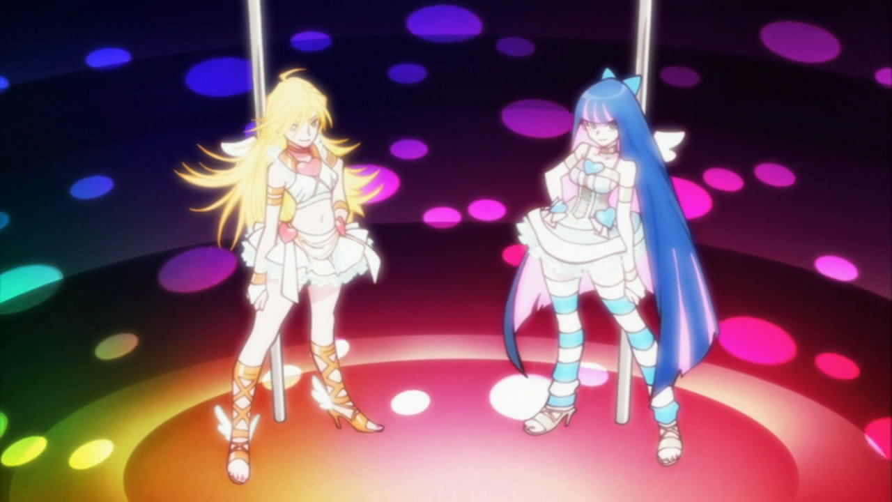
Sooner than I thought it would be, the first episode of Panty and Stocking with Garterbelt aired. As I'd kind of feared, judging from the progression of the promotional artwork that was released since the first piece we saw a while ago, it's taken on a much more angular, abrasive, cluttered look than I'd first hoped. Lots of it is just REALLY fucking ugly. Like, a modern ugly western cartoon style that's been copied by a japanese artist with the typical "detail-everywhere-lines-everywhere-composition-doesn't-matter-just-fill-it-all-in-with-shit" mentality that's one of the main things I dislike about anime and manga visually.

But lots of it is also REALLY FUCKING AWESOME. Because it's being made by people who, despite some weird notions of what constitutes """""good design"""" (note the quadruple quotation marks on that), are probably some of the best animators around at the moment, and the project is driven by their sheer love for what they do, and not the desire to churn out just another bland, loveless, pandering product like 95% of what the anime industry produces these days.

Idealogically it is basically FLCL 2.0. And how anybody can say this as a negative really baffles me (but then again many anime fans seem to genuinely just not like animation).

To hell with write ups and detailed analysis, random screenshot time.


I like the use of text, the colours in most of it, the random art style changes, and the many ridiculously cool camera moves, both hand-drawn AND CGI! I can't possibly capture those in still images but they are really stunning. Dynamic camera moves in action scenes are one thing Japanese animators are often really good at (along with moving lots of little bits independantly but also together), but there's massive full-on swooping scenery moves as well! The fact that they used CG intelligently and near seamlessly along with it was a pleasant surprise.

It's also funny to see just how much of a westaboo Yoh Yoshinari really is. As it turns out, the show uses the two-part format common to 90s and onward western cartoons, and it even has appropriately-styled title-cards, including the front-lined artist credits that John K. brought back to the format with Ren & Stimpy.


It's like I'm really watching Cartoon Network!


By the way, I (obviously) haven't been updating much lately. The reason for this is that I started feeling like I was turning into something I really don't want to be seen as: a critic. Not that I don't want to write about things, but I've basically hit a lifetime low of actually producing work. I've had lots of employment recently, but to be honest pretty much none of it will be going in my showreel, or even getting shown to anyone ever. And in between, I've just been feeling very depressed and demotivated. Basically I've been writing all high-and-mighty and feeling like I've got no right to since I've not exactly been producing stellar work that proves I know what I'm talking about in the meantime. And, honestly, I don't: as far as I'm concerned I'm still a student, despite having been practicing professionally for over two years now. However, I don't want to stop writing this blog, however underqualified I might be to do so, because, at this point, denying myself something I genuinely enjoy is probably the worst thing I can do.

Thus, from now on, I plan to impose a new rule on myself: with each entry I will include something visual to go with the writing, that I have produced. A sketch, a doodle, a design, an animation loop, ANYTHING. Literally no matter how shit it is. Even if I have to open MS Paint and scrawl a penis  in 2 minutes before hitting the "Publish Post" button. I think my biggest limiting factor right now is that I am too scared of my drawings being shit, so I need to get away from that.

This entry falls under this ruling too, so here's some unspectacular sketches of one of the really weird alien design's from Hitoshi Tomizawa's wonderful Alien Nine manga (also an anime by J.C. Staff, though sadly it doesn't cover enough of the story to include this creature).


Oh, and since it's related, here's a shit MS Paint doodle for a "draw a scene from an anime for others to guess" thread on /a/.

It's pretty accurate.

Oh, also, I saw Scott Pilgrim vs. the World and Toy Story 3 recently. Both were good, better than I was expecting. Scott Pilgrim was just too much raw fun for me to maintain whatever reservations I had about it beforehand, and I would totally have gone to see it again. Toy Story 3 was the first Pixar movie since The Incredibles that I didn't think had something really, critically wrong with it. Might talk about it more later. Also Up is STILL SHIT.