I've been up to a bit since last time. Here's another League of Legends character reimagining. This one's Rammus. Click for full size plz.
Like the Annie one my aim was to take aspects of the lore and gameplay of the character and better represent them visually. Rammus is basically an armadillo that lived in a desert, then randomly wandered into a jungle, found a thing, and that thing made him an ARMORDILLO (read his original lore here). I originally wanted to represent this chance transformation by making him look really horrid and deformed, as if his mutation was completely random, and it's only by sheer luck that his body is even functional. However, I found it hard because I'm not a very good designer.
So instead I focused on two other things. First, the fact that his original design doesn't actually look like an armadillo, just a generic cartoon armoured thing. So I looked at lots of reference of different kinds of armadillo, including screaming hairy armadillos, pink fairy armadillos, and three-banded armadillos (the only kind that can actually curl into a ball). My second focus was the armour aspect. His lore says that he has crafted a suit of armour for himself. In-game, his innate passive ability gives him bonus attack damage based on his armour, and his Defensive Ball Curl ability, which increases his defenses, also causes him to reflect damage against those who attack him, again based on his armour. Essentially, as you buy more armour items, he does more damage. However, his actual design represents all of this with nothing more than a crappy little spiked plate on his belly. I tried putting armour in the places that aren't already covered by his shell, which makes sense, but it just didn't work for what I wanted visually. Thus, I went with sticking spikes all over his shell to make him really look like something you wouldn't want to punch. I felt showing a progression like this was the best way to get the idea across, and I'm actually reasonably pleased with it. I had some serious issues during the design process, as I got that thing where I fall in love with the first crappy sketch I did, but when I try to replicate it I at first fail, then succeed, but it only makes me realise how bland it actually is. Many thanks to Joe, Blanca, and Ben for encouragement and advice, mostly on colours. I may not have made use of all of your suggestions, but they were all given proper consideration.
Here are some sketches. You can probably pick out the one that I basically just used for the final image.
There were also some much earlier doodles on the Germany sketchbook pages I posted. I don't actually know if I'm going to do any more of these since I don't play League of Legends anymore. I might just do some straight-up fanart for Dota 2 though. The designs in that game are overall pretty good and I wouldn't want to outright change any of them, but it might be fun to illustrate them in a more cartoony way.
Other than that, here's the video I said I probably couldn't talk about last time, again directed by David Wilson.
I was lead animator, doing key animation on many shots, as well as in-between animation on a couple of others (chiefly the bit where he walks up her body), and effects animation on others (the comets mostly). It was a grueling nightmare but was also sort of fun (?), and it's nice to be able to put LEAD ANIMATOR on a job for once. David Wilson is also a really ambitious director, so it's always demanding and fun to work with him.
I've got some other projects lined up in the near future which will hopefully be cool when they come to fruition, but I can't say what they are either (I signed an actual NDA for one of them!)
I had my 27th birthday and we went to see Wreck-It Ralph. This image sums up the experience for me.
Everything I suspected from the trailer was true (essentially, that the videogame references would be pretty hollow, that they only had a small pool of licenses to pull from, and it would basically all just be a vehicle for a standard Disney plot, rather than actually making an interesting use of the real characters). However, I actually ended up enjoying that plot and the characters more than I wanted to admit. Unlike Pixar's last two offerings (sequels don't count), it actually became more rather than less interesting once the plot started, and it made me care about the characters enough that I genuinely wanted them to win.
That or I'm just a sucker for cute little girls. Hey guess what, I watched the whole fourth season of Hidamari Sketch recently and I enjoyed it all and I didn't even feel a little bit bad that I enjoyed it.
I have been enjoying playing Pathfinder (an offshoot of Dungeons and Dragons) with Joe and Blanca for the past year or so. Recently our campaign has escalated with the dramatic death of a much-loved player character (though this isn't the first time, just the first since I joined). Right now our party is considering abandoning the current dungeon (as it turns out we're underleveled for it) and attempting to take out the big bad in a non-standard fashion, which might result in hilarious disaster. I might try to do some drawings of our characters in the next week before I have to start my next job.
Oh yeah, the leak in my room seems to have actually been fixed (after one unsuccessful attempt), the mould in the bathroom has been scrubbed off, painted over, and doesn't appear to be returning, and I haven't seen any signs of bedbugs in months. So my life is looking up right now! I've also booked tickets to see The Book of Mormon in June, which promises to be tons of fun (birthday thanks to dad and Myra).
I can't think of anything else to write so I'm just going to end this post awkwardly.
Annie, like Veigar, is a fragile burst caster. She's designed to be easy to play rather than be viable at a high level, as her abilities are simple, and her kit means she has to capitalise on her opponents' mistakes rather than being able to really command an engagement. She's hampered by a short casting range, so in general other mages like Veigar and Morgana will beat her in a straight-up fight, but she's one of the only champions with an instant AOE stun, and a massive amount of near instant burst damage, so with a well-coordinated team she can still be a threat.
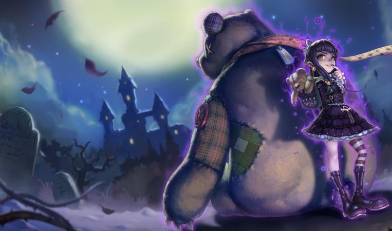
Working on this reminded me how hard I find it to actually finish an image. I always end up at this unhappy stage where I feel like it's both overworked and underdeveloped. I tried using some actual custom Photoshop brushes for the first time ever, and they worked nicely for the linework (though you can't really see it when it's shrunk down), but I had no idea how to make the colours and shading look good. I just about like the actual colour scheme but the brushwork doesn't really hold up for me. At one point I had that deeper shading over the whole image, but it just felt like too much so I left it on Tibbers alone to make Annie pop out more. She still feels kind of flat, though. Also having the edges of the image be cut off like this feels lazy, but when I had Tibbers's whole body showing it looked lame (it makes him look bigger if he's partially hidden). Bleh. I might go look at Blanca's and Joe's blogs and cry into my keyboard some more. At least the design phase was fun, though I struggle to really call it "design" since, as mentioned before, I still feel she's just a stock-little-girl-a-la-Jonno with some details. These are all things I just have to work on in the future, though.
I considered adding a bit of writing about this particular vision I have for the character but I decided against it as it would be, first, a load of fanwank, and second, it would contradict what I was trying to achieve. Basically I didn't like how the different aspects of the original character seemed to have been invented in isolation: the lore was written by one person, the design was done by another, and the game mechanics by yet one more, and none of them ever spoke to eachother. The lore said nothing about her personality, and the design said nothing about either her personality or her abilities (aside from her having a flame in her hand, so original). I feel that a good design should at least suggest something about every important aspect of the character, so I wanted to reflect her abilities, background, and a personality all at once.
I was originally going to have Tibbers be burning (as he is in-game), but I thought it would be better to let the other aspects of the image suggest her association with fire rather than making it explicit. Even if you don't know she actually controls fire magic, you should be able to draw some conclusions from her burnt clothes, flamey hair, and Tibbers' fur. I shan't say any more about my intentions since I sort of wrote about them last time.
Here are some more development sketches, for fun. I'm leaving out a few from when I came back to this project after a couple of weeks on a job and had apparently forgotten how to draw since they're an embarassment. You get to see the derpy Tibbers drawings, though, because I think there's a good progression there. Chances are some of the stuff here is actually better than what I settled on in the end, but such is the way of hindsight.
You also get a little bonus sketch with a hypothetical end-game item build. Is Void Staff, Sorceror's Shoes, and Abyssal Sceptre redundant? (yes) I actually like this a bit more than the proper illustration up top. :(
Some of the reference material I used was fun, too. I found this great archive of vintage tinted postcards.
Tibbers is mostly inspired by Kodiak bears. I wanted to get the "big head little face" look that some bears have, but for some reason I was never able to pull it off like I wanted. I like the upside-down-heart-shaped head though, that's my own little touch (most bears have a right-side-up heart for head). Joe said of an older attempt at this illustration that bears often look like they're wearing pyjamas. I think a couple of my earlier sketches captured that better but oh well.
By the way, I must extend thanks to Joe in general for giving me advice when
I'd done a drawing and hated it but couldn't decide why. I have a
tendency to hide stuff I do because I'm ashamed of it but getting a
second eye on it really helped. I also had a good conversation with Danny Boyle last week that got me thinking about how I approach this sort of project, so thanks to him too.
I was originally going to append this onto a "real" post as I've done in the past, but I think there's enough here that it can stand by itself. As hard as this was it was worth doing and I'd like to do it again. I'm just about to start on another job that's probably going to be really hard, though, so we'll see when I've got the energy and motivation to do it. I'll try to do at least a small post (without art) next weekend, though, since I've still got stuff I want to just write about.
It is a common concept in games to divide the content into distinct chunks. This is sensible: it allows the player to deal with only a small amount of information at a time, rather than having to consume the entire game in one continuous stretch and possibly become fatigued or feel overloaded. In games with a linear progression, where the player character is implied to be travelling from point A to B of a sprawling overworld, there is an additional tendency to subdivide. There are larger "worlds" divided into smaller "levels". This additionally allows a happy compromise of varied, cohesive, and economic design: graphic elements can be reused within a world, so that each level does not need new artwork, but as long as nothing is reused between worlds they will each feel visually distinct. Super Mario Bros. made use of the basic idea of "worlds" and "levels", but it had not yet occurred to the designers to maintain a consistent set of graphics within each world: the franchise would see that idea developed over the course of the next two games.
When Sonic the Hedgehog was developed, Sonic Team decided to be unique snowflakes by referring to "Zones" instead of worlds and "Acts" instead of levels. The first game had 3 acts per zone, but this was trimmed to two for the sequel and this has remained the standard for most games in the franchise since. Since Sonic had a much later start than Mario and other platforming series, the idea of having the worlds be visually distinct was already standardised. However, the Sonic games additionally paralleled the music with the graphics: each zone had its own musical theme, quite different from the conventions of the Mario franchise where overworld, underwater, subterranean, and castle themes would be used and reused according to the nature of the environment, rather than the theme of the world. Sonic 3 developed this idea further by having the music change slightly in the second act of each zone: sometimes only the bassline would be different, or the percussion more sparse, or the structure rearranged just a bit — and sometimes it would be almost an entirely new track with just instrumentation and some key bits of the melody in common. Compare the two acts of Launch Base Zone, for example...
...to the two acts of Hydrocity Zone.
The physical characteristics of the levels are also occasionally more distinct between acts. The tropical Angel Island Zone is firebombed halfway through the first act, with this devastation remaining throughout the second. Near the beginning of Carnival Night Zone Act 2, Knuckles shows up to turn off the lights and flood most of the level. The Launch Base Zone, having been partially blown-up as part of a failed booby trap towards the end of act 1, is all exposed pipes and waterworks in act 2. Even when there isn't a clear visual distinction, just the change in music is often important in establishing a transition in moods: act 1 of Marble Garden has an upbeat, bouncy feel, whereas act 2 is more subdued and contemplative, thanks to a much more relaxed beat, a lead synth with a longer, more reverbing decay, a softer bass sound, and a few other subtle touches. The result is a distinctly different atmosphere.
This concept continued into Sonic & Knuckles, which was more of a continuation than a sequel, and was developed further. Sandopolis Zone begins in a scorching desert, but act 2 takes place inside a dark, ghost-infested pyramid - the music, in kind, takes a dramatically sinister turn. The most significant transition is not in the final zone, the Death Egg, but in Lava Reef. Initially the setting befits the name, with dangerous active lava-flows and fire-based traps aplenty. The music is bubbly and smouldering, but has a mellow undertone to it, lacking the aggressive feel one would usually expect from a fire-based stage. At the beginning of act 2, however, all the lava suddenly cools and solidifies, the entire colour-scheme of the level changing from heated oranges and reds to serene blues, and the shift in the music befits this: the only component that seems to carry over is a background accompaniment, rather than the lead melody, yet oddly the whole track feels familiar, as if it's changed completely on the surface but still consists of the same fundamental elements. That the change between the two acts should be so dramatic is fitting for another reason: it's from this point on that the game's plot actually starts to develop.
Ristar is a game developed towards the end of the Mega Drive's life cycle. As such, it was overlooked at the time, but has garnered a bit more attention retrospectively. Partly it's because, like Dynamite Headdy, it's a pretty good game, with a simple but satisfying central mechanic (you can grab enemies and face-smash them, also climbing up walls with your face and swinging off handles like a shooting star), rich level design, and appealing visuals. However, it's also noteable because it was actually developed by Sonic Team, purportedly based on an early, rejected concept for Sonic himself. I don't know exactly how much of its staff Ristar shared with the Sonic games, but it feels almost like a natural continuation of many ideas from the latter.
When we begin a stage, a title card pops up that is very reminiscent of Sonic 2. However, not only are the flat, graphic shapes more intricate, but we're also treated to a beautifully parallaxed pan across the planet's scenery. In-game, the environments feel like an amalgam of every Sonic game that came before, though with an extra solidity, richness, life, and boldness of colour that can only be the result of a more experienced art team.
The Acts are here, though not by name: each of the worlds (actual planets in this case) is divided into two seperate levels. However, where the Sonic games at the time had only toyed a bit with the idea of visually distinguishing individual acts, Ristar goes the whole hog with almost completely distinct graphics for each one.
A few bits are reused, generally floor tiles and the odd bush, which, along with consistent visual motifs, prevent the acts from feeling disjointed, but the assets are almost entirely newly drawn each time. Even the boss chambers (which are too short to constitute levels) get their own graphics.
And not only are the individual elements that make up the whole drawn anew for each act, but every one has an overall artistic direction and colour pallette that marks it out from its predecessor. In most cases, we move from an open environment to a more closed one, with the colours often becoming darker or more muted to mark the transition. This makes sense from a practical standpoint, since Ristar has to initially land on the surface of any planet he travels to, but it also intils a great feeling in the player, as if we're breaking into a fortress and penetrating a lair of evil.
And the music feels like it's been developed from the seeds of Sonic 3 & Knuckles in a similar way. For one thing, the tracks are longer: Sonic 3 & Knuckles has loops ranging between 40 seconds and a minute; almost all of Ristar's tracks loops at around 1 minute 20 seconds. The compositions feel a bit more intricate as well, with a few more embellishments and more detailed use of the instruments themselves. Compare Launch Base Zone act 1 above to Crying World, the act 1 theme for Planet Automaton.
Both use a mechanical sounding style, focusing less on melody and harmony than on a rythmic beat and "samples". Launch Base's consist mostly of vocal clips, percussive hits, and sound effects, whereas Automaton's are rapid, robotic bleepings and micro-tonal descending scales. The latter also meshes well with the frequent use of pitch-bends, giving the whole piece a cohesively dissonant feel.
Also contrast Lava Reef act 1 with parts of Planet Scorch's act 1 theme, Busy Flare.
Although the two tracks describe a different atmosphere, it's worth noting the rapid, effervescent background synth starting at 8 seconds in Scorch's theme, and the slow attack and subtle vibrato on the chords at 20 seconds. These are all techniques that I don't think crop up much if at all in Sonic 3 and Knuckles's music. Glissandos are another thing that's used a fair bit in Ristar's tracks that I don't think comes up in Sonic's.
Even more important, however, are the differences in the BGMs between the acts of each planet. Just as with the graphics, there's a completely fresh piece of music for each one, but with all the crucial, recognisable parts of the melody carrying over. Often the mood that each piece invokes is quite different, but it always feels like it's been developed from one act to the next. Listen to Planet Undertow's two themes.
They're both calm, but each evokes a different brand of calmness. The first is in swing time, the second isn't, so naturally the first act has a bouncier, lighter feel. It also uses carefully constructed bubbling sound effects and shimmering, climbing I'm-not-sure-what-to-call-them-but-they're-not-scales, first heard at 18 seconds. These both suggest bubbles and light-rays breaking the surface of an open body of water. The second act's theme doesn't have so many of these details, but you can hear a little oscillating, pulsing synth starting at 20 seconds, matched by a similar, subtle vibrato on the lead synth at 36 seconds. This is more evocative of the sounds of deep-sea life, or the echoes of grand subterranean caverns. The very sparse opening also suggests a still water's surface. All of these are completely appropriate for the change in environment: the first act takes place at the surface of a series of partially submerged ruins, with a roughly equal distribution of dry land and submerged areas, populated by an abundance of fish, jellyfish, eels, and crustaceans; the second act travels deeper into these ruins, and is almost completely underwater, the only life being a few seahorses and nautilus.
I could write a whole lot for each individual act transition, but I think it best to just let you hear some of the differences yourself. What do they suggest to you?
Planet Flora:
Scorch's second act, compare to Busy Flare.
Automaton's second act, Lock Up, compare to Crying World.
It would also be remiss of me to not mention Planet Sonata, the musical world. The first act begins with some pretty, cascading arpeggios, but it quickly becomes apparent that it's a very short loop. However, in order to progress through the level, one must deliver radios to a series of grumpy-looking birds. Upon doing so, each one will sing a snatch of a melody for you, and as you collect these they will be added to the BGM. Once you've satisfied all the birds and heard the full tune, it provides the backing for the miniboss. I can't find a version that describes the development on Youtube, but here's an MP3 that does the job, courtesy of the Ristar Cluster.
And in the second act, which takes place inside a sprawling complex of musically themed architecture, we're treated to an even bouncier, more spirited version of the same track. I promise you're going to be singing this melody all week.
The boss is something quite special. We walk onto a stage to see a little bird singing the game's boss music. Then a big, mean, ugly, and, crucially, tone-deaf bird drops in. So he knocks the little bird off his perch and, well, I'll let you listen for yourself.
Anybody who's ever enjoyed Touching Fuzzy and Getting Dizzy will appreciate the brilliance of this, I'm sure (though I should note that Ristar predates Yoshi's Island!) There's even a secret code that lets you hear the entire game's soundtrack with this distortion effect applied to it.
Why do I think all this business of reinterpreting existing musical themes, rather than reusing the exact same ones or composing completely new pieces for every area, is important? It's because it facilitates something very specific to games where you're on an adventure through environments that develop in a logical fashion, and that is the feeling of progress. Using the same pieces of music all the time makes the whole thing feel flat, as if you're not really travelling anywhere. I think this might be a weakness of many Mario games. Conversely, if every area you encounter has a completely unique BGM, they feel disconnected, as if it's not really one contiguous journey (Contra 3 springs to mind as a random example). Intelligent reinterpreting of musical themes is, I feel, the best way to make use of the "worlds" and "levels" concept I started with. The same ideas apply for the visuals of a game as well, but I personally feel that music is more important in creating atmosphere.
Of course, this isn't a completely new idea that I'm talking about. Motifs are an age-old device in music and many other artistic media. Both Ristar and Sonic actually make use of them in a more traditional sense, by having the melody from the title screen theme make its triumphant return during the ending. Ristar, however, has one up on his predecessor again with another subtle use, as the bassline from the intro video, where we first see Greedy, the big bad, reappears for the final confrontation. It's pretty much a leitmotif!
Sonic and Ristar are probably not the first or best games to make use of these ideas. I just thought it was really interesting to see them being clearly developed from one series to another. I mentioned that I hadn't found out exactly how many members of Sonic Team actually worked on both series, but one thing I do know is that two of Ristar's composers, Naofumi Hataya and Masafumi Ogata, worked on the music for Sonic CD, whose Present, Past, Bad Future and Good Future versions of every level each have their own fitting musical accompaniments. Clearly, they were already familiar with this concept by the time they worked on Ristar, so it's little wonder that what they did for it was so skilful.
I'm currently working on a comic, but am finding it hard to get into. Comics are really, really hard! It's like a storyboard, only without the knowledge that you will be able to use acting or timing to compensate for stuff that isn't clear in the board itself. To take a break I did a few doodles trying to reimagine Annie from League of Legends, sort of like what Joe Sparrow did with Veigar and Cho'Gath. Only I'm not as good of a designer as he is.
Original.
Really she's just a generic little girl with fire powers and a bear. I made her a... more evil-looking generic little girl with fire powers and a bear? Eeeeeeh. Her lore as written for the game is that her parents are a pair of refugee mages from the conveniently-evil city-state of Noxus. Which is great because it suggests absolutely nothing about Annie's personality, so I still have almost nothing to work from. Some digging reveals that she's friends with a sad mummy, and is "surprisingly genteel" in her daily life, but that's pretty boring. I figured it'd be neat if she looked like her parents, being from a high-class background despite their refugee status, had tried to put her in a nice dress and carefully brushed her hair, only for her to burn it all because burning things is hilarious to her. I couldn't really figure out an easy way to draw burnt hair, though. And as I kept drawing more she ended up looking more and more deranged somehow. I think I subcosciously just wanted her to be really evil and malevolent. The dark circles under her eyes also evoke a little too much of a gothic-lolita flavour, but I like them because of the suggestion that her pyromania keeps her up at night. These were fun doodles but I wish I could figure out a way to be more stylistically adventurous. Mostly I was just changing between two different hairstyles and fiddling with eye shapes. I might continue to try to work up something better though. Or just toss it all out and do another champ.
The illustrations for Annie's other skins are mostly pretty foul because apparently Riot's artists can't draw girls without massive tits. The Reverse Annie picture is decent and pretty funny though.
And apparently the Chinese game client has different artwork, which is really generic anime stuff (rather than generic modern digitally painted fantasy illustration stuff) but most of it is capably done, at least.
I'm looking at the side bar and it seems like I've got a few more people subscribing to this blog than when I last checked. I'm not sure when you all started, but welcome! If you came here recently, you did so at a good time. For bonus points, find where in this post I changed tenses. Also, I offer no apologies at all for the excessive Youtube embeds. If your Macbook overheated and the keyboard melted off the chassis I'm sorry, but it's your own fault.