But lots of it is also REALLY FUCKING AWESOME. Because it's being made by people who, despite some weird notions of what constitutes """""good design"""" (note the quadruple quotation marks on that), are probably some of the best animators around at the moment, and the project is driven by their sheer love for what they do, and not the desire to churn out just another bland, loveless, pandering product like 95% of what the anime industry produces these days.
Idealogically it is basically FLCL 2.0. And how anybody can say this as a negative really baffles me (but then again many anime fans seem to genuinely just not like animation).
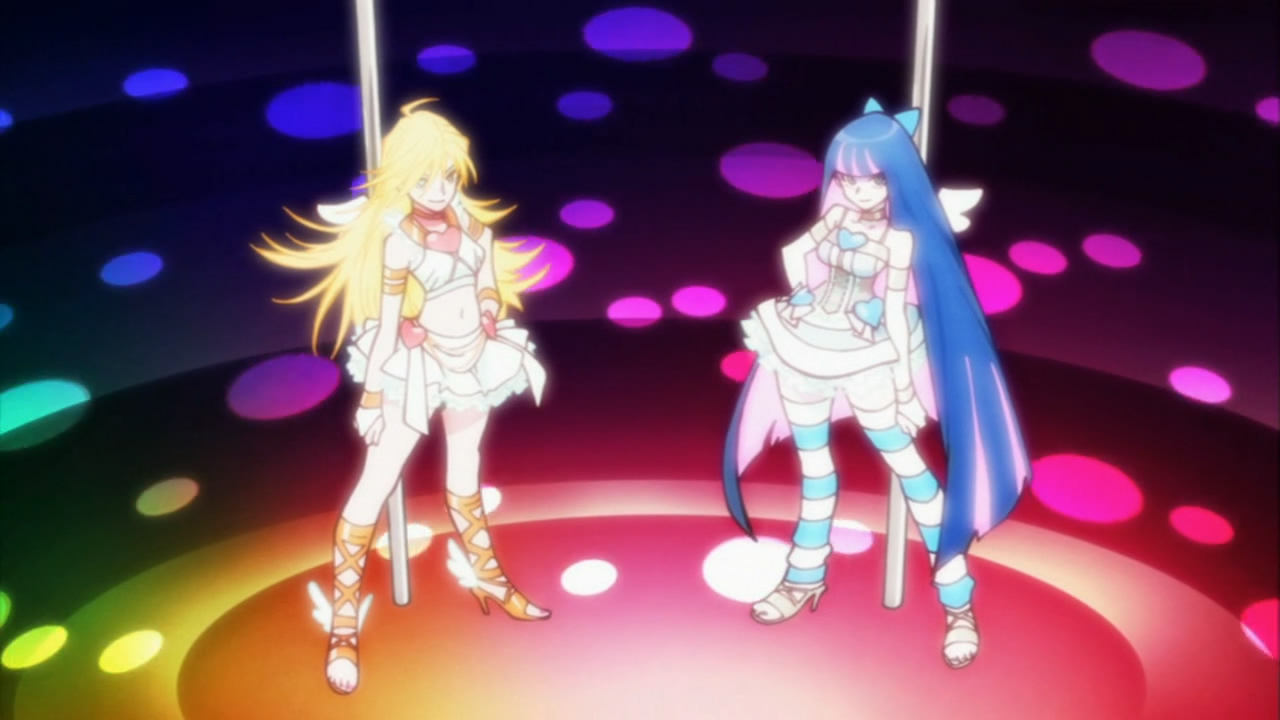
To hell with write ups and detailed analysis, random screenshot time.


I like the use of text, the colours in most of it, the random art style changes, and the many ridiculously cool camera moves, both hand-drawn AND CGI! I can't possibly capture those in still images but they are really stunning. Dynamic camera moves in action scenes are one thing Japanese animators are often really good at (along with moving lots of little bits independantly but also together), but there's massive full-on swooping scenery moves as well! The fact that they used CG intelligently and near seamlessly along with it was a pleasant surprise.
It's also funny to see just how much of a westaboo Yoh Yoshinari really is. As it turns out, the show uses the two-part format common to 90s and onward western cartoons, and it even has appropriately-styled title-cards, including the front-lined artist credits that John K. brought back to the format with Ren & Stimpy.


By the way, I (obviously) haven't been updating much lately. The reason for this is that I started feeling like I was turning into something I really don't want to be seen as: a critic. Not that I don't want to write about things, but I've basically hit a lifetime low of actually producing work. I've had lots of employment recently, but to be honest pretty much none of it will be going in my showreel, or even getting shown to anyone ever. And in between, I've just been feeling very depressed and demotivated. Basically I've been writing all high-and-mighty and feeling like I've got no right to since I've not exactly been producing stellar work that proves I know what I'm talking about in the meantime. And, honestly, I don't: as far as I'm concerned I'm still a student, despite having been practicing professionally for over two years now. However, I don't want to stop writing this blog, however underqualified I might be to do so, because, at this point, denying myself something I genuinely enjoy is probably the worst thing I can do.
Thus, from now on, I plan to impose a new rule on myself: with each entry I will include something visual to go with the writing, that I have produced. A sketch, a doodle, a design, an animation loop, ANYTHING. Literally no matter how shit it is. Even if I have to open MS Paint and scrawl a penis in 2 minutes before hitting the "Publish Post" button. I think my biggest limiting factor right now is that I am too scared of my drawings being shit, so I need to get away from that.
This entry falls under this ruling too, so here's some unspectacular sketches of one of the really weird alien design's from Hitoshi Tomizawa's wonderful Alien Nine manga (also an anime by J.C. Staff, though sadly it doesn't cover enough of the story to include this creature).


Oh, also, I saw Scott Pilgrim vs. the World and Toy Story 3 recently. Both were good, better than I was expecting. Scott Pilgrim was just too much raw fun for me to maintain whatever reservations I had about it beforehand, and I would totally have gone to see it again. Toy Story 3 was the first Pixar movie since The Incredibles that I didn't think had something really, critically wrong with it. Might talk about it more later. Also Up is STILL SHIT.
13 comments:
Man I need to see that Anime... if you can honestly call it FLCL 2.0 then it will be worth my time.
Don't get depressed about your output, we all gotta draw what pays the rent. I currently find myself Illustrating webnovels, time-waster online dressup doll games, t shirt screenprints and murals rather than my preffered graphoc novels and paintings but hey.
Also PS. Text me if you want to go to expo on the 31st.
Emily
Oh god I thought you were someone else for a minute because usually there's just one guy who comments on my blog and he's expressed interest in this show so I assumed it would be him. How confusing.
Definitely check it out. Go on tokyotosho.info and get the Horriblesubs version. The first half might be offputting because of OTT toilet humour, but the second half is BALLS TO THE WALL awesome. Just got done rewatching it again. Can't wait till next week.
I just watched it (on youtube no less) and I very rarely stopped grinning. I agree about the visual clusterfuck (that much was confirmed by the trailer I linked you) but it exemplifies what I like in modern japanese media, which is batshit craziness with an undercurrent of flippant erotic/toilet humour. the animation in places is obviously superb but even the bits that were jokily sparse were funny. and the exploding models were amazing. gg, gainax.
also, I'll probably be going to the expo so I may see you there if you attend.
I did literally lol at the first model. Naturally I won't get that again but it will continue to amuse the shit out of me forever.
I do also sort of like the really cheaply done bits (where they just have everything static except maybe the heads tweened or something on seperate layers). It's just nice that they're willing to allow that sort of massive contrast, rather than taking the safe route of everything being sort of the same quality.
It also means they get to spend more money on the actual money shots.
SHIT I JUST REALISED I SAID I'D CONSPLAY AS TETSUO IF I WENT AGAIN. Gotta sort that out.
BWAHAHAHA... not sure if I'm cosplying cuz Ally probs can't come and she's my wingman for cosplay... may just dress up in madness instead.
Which scenes would you say are the standouts, both positively and negatively? I'm just kind of curious - which scenes did you find particularly bad, and which did you find particularly good? Yoshinari's bit of Panty and Stocking attacking the poop monster is a given since, well, it's Yoshinari, but what about the others?
Also sorry for being a complete stranger and randomly commenting out of the blue - I just did a google search for "Panty & Stocking blog" to find out what people thought of episode 1. I saw your first entry about it where you talked about /a/'s dumb manchild reaction so I thought I'd read some other entries.
Well, good stuff from part 1:
All the camera moves in the early part (lots of it is probably CG but it's easily among the most well-executed CG I've seen in anime so far, also note that it's seamlessly integrated with hand-drawn stuff like the text at around 1:30, and some of it I can't even tell what's what like at 4:16).
The two shots where all the police cars stream in around 8:18.
Obviously the whole transformation and attacking bit as you mentioned.
I thought the shit monster itself was actually nicely animated, too, though it's a shame it didn't get in-betweened smoothly at all for the most part.
For the second half:
The big birds-eye swooping camera move before the police cars all stream in again.
The spinning and the CARSPLOSION from 16:25
The low-angled shots of dodging the falling cop cars from 16:35.
More CARSPLOSION at 17:10.
That whole "Playing chicken" sequence from 18:48. Even the static shots there look great.
The transforming and getting overexcited and going REALLY FAST from around 20:20. I like how even the text just becomes a big blur. The delayed burst of wind when he crashes through the station is also awesome.
TEXTSPLOSION at 21:30.
For the bad, mostly anything that looks like this or this, basically where everything's just a big jumbled mess of clashing lines and colours and it's too cluttered for me to comfortably read anything. Also many aspects of the way characters are drawn such as Garterbelt's hand in this shot (I'm not a fan of the squared off fingers in general), and the way the background woman in this shot is such a horrid mess of random angles and shapes. I also dislike that particular shot in general, not so much because of the way P&S are drawn but more because it just looks thrown together, rather than planned to lead your eye anywhere. It's not cluttered like those first two, but it's difficult for me to look at in a more subtle way.
This is as much as I can really put into a lowly comment, though. There's millions of little positive and negative things I could pick out in almost any scene. The colour design alone for either of the two halves could probably fill up a whole blog entry.
I don't mind getting random comments! Even if you were a troll I would be at least amused, though I must curse you because now you made me stay up till 3:30 writing that instead of watching ep 1 of "You Are Delicous" like I'd planned.
Also, how did you know it was Yoshinari that did that one part? Did you just kind of intuit it yourself, or was it the from a thread on 2ch that somebody translated?
I agree with some of those (the art in the first 'bad' one you linked did look pretty rushed... altough I still liked the ghost's animation), but I think the whole "blocky hands" bit is more of an opinion thing than a mistake due to a lack of skill on the animators' part - that's kind of how their hands are meant to be drawn, and making them all curvy would just mean going off model for no real reason.
as for the Yoshinari scene, I just guessed it, and I think 2ch thought the same. I can't quite pinpoint why - I'd say "it was smoother and less jumpy than the usual Kanada-esque style of the rest of the episode" but there's way more to his style than that, and I'm just not knowledgeable enough to explain it. maybe the way the special effects were done helped too.
also tbh I thought Panty letting go of Chuck and slamming into the ghost train, while not amazing, was kinda better than the CG car explosion at 17:04. it wasn't BAD but the CG stood out a bit too much to me. I know why they had to do that but still.
Oh no, I don't think the hands are because of lack of drawing skill or anything, it's just a design decision I happen to dislike.
Actually, I'd say my complaints in general are more to do with planning and decisions, rather than rushed or unskilled draftsmanship. It's not that the first shot looks like it was drawn by a bad artist, for example, just that it was composed and planned poorly (I really liked the Ghost's head-wagging there as well).
"it was composed and planned poorly" how so?
I might be wrong but I felt that the bits that looked more rushed were more due to a lack of budget - I can imagine Gainax's higher ups not wanting to give a risky show like this huge funding. hell not even Gurren Lagann had a particularly big budget and it as a show that Yamaga absolutely wanted to see - similarly if you look at interviews it doesn't seem like he's particularly excited for this project.
"I really liked the Ghost's head-wagging there as well" lol same here
Well just look at that first image. Everything about it's just been thrown in haphazardly. Although you've got Panty on the right, Ghost in the middle, and Stocking on the left, but there's no negative space to seperate them, no use of colour to make them read clearly as seperate from eachother, no lines of action or directionality to the posing or anything.
Compare this random inebetween from another scene. Obviously it's a completely differently framed shot, but it has everything I mentioned there. This one is more similarly framed, but it reads alot better because theres's space around and within the characters, and their silhouettes are much clearer. It's not just a bunch of jagged lines going in all different directions. Honestly, looking at that first one is almost like stabbing shards of glass into my eyes.
There are certainly scenes which obviously have had less money put into them than others, but that's to do with the amount of animation more than good composition. It doesn't (or shouldn't) really cost more money to design a clear composition than a cluttered one.
Post a Comment